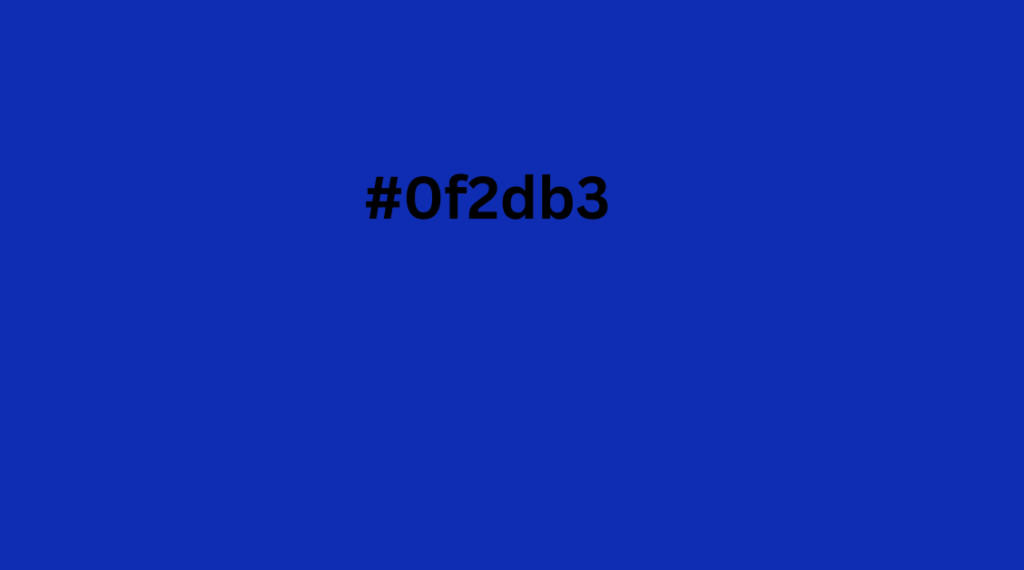
The color #0f2db3 is a bold and striking shade of blue that stands out wherever it’s used. It’s not just a color; it’s an opportunity to make a lasting impression in design, fashion, and everyday creativity. Let’s explore how you can make the most of this vibrant hue and its SEO potential.
What is #0f2db3?
#0f2db3 is a color code used in web design and graphics. It tells computers how much red, green, and blue (RGB) light to mix together to create this unique shade of blue. Here’s the breakdown:
- Red (R): 15
- Green (G): 45
- Blue (B): 179
This means #0f2db3 is predominantly blue with a touch of red and green, making it a color that’s deep, rich, and eye-catching.
Why is #0f2db3 Perfect for SEO?
Using the keyword #0f2db3 effectively in your content can boost visibility for color-related searches. Here’s how you can integrate it:
- Content Optimization: Mention #0f2db3 throughout your article in natural and meaningful ways, such as its applications, color pairings, and design benefits.
- Alt Text and Metadata: Use #0f2db3 in image alt texts and metadata to improve search engine rankings.
- Visual Appeal: Create visuals with #0f2db3 that attract attention and are shareable on social platforms.
The Brightness and Versatility of #0f2db3
The intensity of #0f2db3 makes it a great choice for dynamic designs:
- HSL (Hue, Saturation, Lightness):
- Hue: 229° (a vibrant blue tone).
- Saturation: 84.5% (highly vivid).
- Lightness: 38% (balanced brightness).
- CMYK (Cyan, Magenta, Yellow, Black):
- 92% Cyan
- 75% Magenta
- 0% Yellow
- 30% Black
Creative Applications of #0f2db3
This bold blue can elevate various projects, from digital to physical designs:
Web and Graphic Design
- CTA Buttons: Grab attention with #0f2db3 buttons.
- Backgrounds and Text: Pair it with white or light gray for a clean look.
- Branding: Use it for logos to convey professionalism and trust.
Interior Design
- Accent walls in #0f2db3 create a focal point.
- Use in modern decor for a sleek, contemporary vibe.
Fashion
- Outfits in #0f2db3 make a bold statement.
- Accessories like ties or bags in this shade add elegance.
Colors That Complement #0f2db3
To make your designs even more appealing, pair #0f2db3 with these colors:
- Complementary Color:
- #b3950f (golden yellow for contrast).
- Analogous Colors:
- #0f7fb3 (blue-green).
- #430fb3 (deep purple).
- Triadic Colors:
- #2db30f (vibrant green).
- #b30f2d (bold reddish-pink).
Accessibility and Inclusivity
Not everyone sees colors the same way, so it’s essential to ensure #0f2db3 is accessible:
- Protanopia: Appears less intense but remains visible.
- Deuteranopia: Slightly muted but still recognizable.
- Tritanopia: May appear more grayish.
Shades and Tints of #0f2db3
You can create variations of this color by adding black, white, or gray:
- Shades (Darker):
- #061246 (dark navy).
- #091b6b (rich dark blue).
- Tints (Lighter):
- #7e94f4 (soft blue).
- #b5c1f9 (light sky blue).
- Tones (Softer):
- #2d4095 (muted navy blue).
- #1632ac (calmer royal blue).
Why Designers and Creators Love #0f2db3
This color is vibrant, professional, and adaptable. Here’s why it’s so popular:
- Visual Impact: Draws attention without overwhelming the viewer.
- Versatility: Works across industries, from tech to fashion.
- Modern Appeal: Feels contemporary and fresh in any context.
Final Thoughts on #0f2db3
The color #0f2db3 isn’t just a hue—it’s a tool for creativity and communication. Its striking appearance, versatility, and SEO potential make it a must-have in any designer’s palette. Whether you’re working on a website, a piece of art, or even a wardrobe update, #0f2db3 can take your project to the next level.


