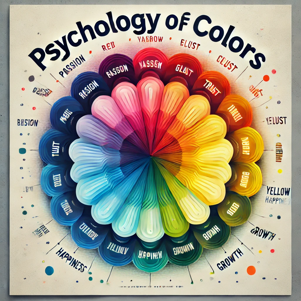
Colors can make or break your design project. Whether you’re working on a website, branding materials, or marketing content, selecting the right color combination is crucial to communicate your message effectively. The right palette not only enhances visual appeal but also influences emotions, perceptions, and behaviors.
In this guide, we’ll explore 10 perfect color combinations for your next design project, complete with hex codes and tips for their use.
1. Classic Black and White (#000000, #FFFFFF)
Black and white is timeless and versatile. This combination exudes sophistication and simplicity, making it ideal for:
- Corporate branding.
- Minimalist designs.
- High-end product packaging.
Why It Works: The contrast between black and white creates visual clarity and elegance.
Usage Tip: Use black for text and white for the background to ensure readability, or reverse it for a dramatic effect.
2. Vibrant Coral and Teal (#FF6F61, #008080)
Coral and teal are a vibrant and modern pair, perfect for:
- Creative agencies.
- Travel websites.
- Youth-oriented products.
Why It Works: The warmth of coral complements the coolness of teal, creating a dynamic yet balanced feel.
Usage Tip: Use coral for call-to-action buttons and teal for backgrounds or accents.
3. Navy Blue and Gold (#001F3F, #FFD700)
Navy blue and gold convey luxury, tradition, and professionalism. They work well for:
- Law firms.
- High-end restaurants.
- Academic institutions.
Why It Works: The richness of gold contrasts beautifully with the depth of navy blue, adding sophistication.
Usage Tip: Use navy blue as the primary color and gold for accents or highlights.
4. Soft Lavender and Mint (#E6E6FA, #98FF98)
This pastel duo is soft and calming, ideal for:
- Wellness brands.
- Children’s products.
- Event invitations.
Why It Works: Lavender and mint create a gentle, inviting aesthetic that soothes the viewer.
Usage Tip: Use lavender as the background color and mint for decorative elements.
5. Bold Red and White (#FF0000, #FFFFFF)
Red and white is striking and attention-grabbing, suitable for:
- Retail and sales promotions.
- Emergency services.
- Sports branding.
Why It Works: The high contrast ensures visibility, while red evokes urgency and passion.
Usage Tip: Use red for headlines or buttons, and white for clean, neutral backgrounds.
6. Earthy Tones: Olive Green and Terracotta (#708238, #E2725B)
Earthy tones are grounding and warm, making them perfect for:
- Organic products.
- Home decor brands.
- Eco-friendly initiatives.
Why It Works: The natural harmony of olive green and terracotta feels organic and inviting.
Usage Tip: Use olive green for text and terracotta for backgrounds or accents.
7. Electric Blue and Neon Green (#7DF9FF, #39FF14)
This bold and futuristic combination is ideal for:
- Tech startups.
- Gaming websites.
- Fitness brands.
Why It Works: The neon vibrancy of green against electric blue creates a high-energy, modern look.
Usage Tip: Use these colors sparingly for highlights and accents to avoid overwhelming the design.
8. Warm Yellow and Cool Gray (#FFD700, #D3D3D3)
Yellow and gray create a contemporary and welcoming aesthetic, suitable for:
- Interior design brands.
- Professional services.
- Modern websites.
Why It Works: The brightness of yellow is tempered by the neutrality of gray, achieving a balanced look.
Usage Tip: Use yellow for icons or highlights and gray for text and backgrounds.
9. Regal Purple and Champagne (#800080, #F7E7CE)
This luxurious combination works well for:
- Event planning.
- Beauty brands.
- Wedding materials.
Why It Works: Purple signifies royalty, and champagne adds a touch of elegance and softness.
Usage Tip: Use purple for headers or bold elements and champagne for background fills.
10. Monochromatic Blues (#001F3F, #4682B4, #87CEEB)
A monochromatic blue palette is versatile and calming, ideal for:
- Corporate websites.
- Healthcare brands.
- Education platforms.
Why It Works: The gradient effect of different blue shades adds depth and consistency.
Usage Tip: Use darker blues for text and lighter blues for backgrounds and accents.
How to Choose the Right Color Combination
- Know Your Audience: Consider the preferences and expectations of your target audience.
- Understand the Message: Choose colors that align with the emotions you want to evoke.
- Test for Accessibility: Ensure sufficient contrast for readability and accessibility.
- Keep It Simple: Stick to 2-3 colors to maintain a clean and cohesive design.
- Use Tools: Leverage tools like Coolors and Adobe Color to explore and test palettes.
Conclusion
The right color combination can elevate your design project, making it visually appealing and emotionally impactful. Whether you’re aiming for bold statements or subtle elegance, the palettes shared in this article offer a starting point for your creative journey.
Experiment with these combinations, adapt them to your needs, and watch your designs come to life. For more inspiration and tools, visit HexColor.ie!


