Introduction
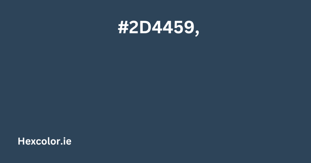
If you love colors and design, you might have come across the color #2D4459. This deep, muted blue adds sophistication and calmness to any design. Whether you’re working on a website, branding, or home decor, understanding this color can help you make better creative decisions.
Basic Information About #2D4459
- Hex Code: #2D4459
- RGB Values: (45, 68, 89)
- CMYK Values: (49%, 24%, 0%, 65%)
- HSL Values: (208.6°, 32.8%, 26.3%)
What Does This Color Look Like?
The color #2D4459 is best described as a very dark desaturated blue. It resembles a stormy evening sky or deep ocean water. It brings a sense of calmness, professionalism, and reliability, making it a great choice for many different design applications.
Best Color Combinations
To use #2D4459 effectively, pair it with the right colors:
- Complementary Color: #59422D (rich brown)
- Analogous Colors: #2D5958 (dark teal), #2D2E59 (deep indigo)
- Split Complementary Colors: #59582D (olive green), #592D2E (burgundy)
- Triadic Colors: #44592D (mossy green), #592D44 (muted magenta)
- Tetradic Colors: #2D5942 (forest green), #592D44 (wine-red), #59422D (deep brown)
How to Use #2D4459 in Design
This color is perfect for:
- Backgrounds – Creates depth and makes text pop.
- Text – Works well for headings and titles.
- Borders – Adds a sleek, professional touch.
Example CSS Code
.text { color: #2D4459; }
.background { background-color: #2D4459; }
.border { border: 1px solid #2D4459; }
Shades and Tints of #2D4459
Shades are darker versions (adding black), while tints are lighter versions (adding white). Here are some variations:
- Darker Shades: #05080B, #192632, #263A4C
- Lighter Tints: #476C8D, #95B0C9, #D6E0EA
How People with Color Blindness See #2D4459
- Protanopia (Red-Blindness): Appears as a dull blue-gray.
- Deuteranopia (Green-Blindness): Looks slightly darker.
- Tritanopia (Blue-Blindness): Appears greenish-gray.
- Achromatopsia (Total Color Blindness): Appears as a shade of gray.
Why Choose #2D4459?
✔ Elegant – Works well in professional settings. ✔ Versatile – Pairs beautifully with many colors. ✔ Calming – Ideal for branding, design, and decor. ✔ Timeless – A classic shade that never goes out of style.
Conclusion
Now that you understand everything about #2D4459, you can confidently use it in your designs. Whether for web design, branding, or interior decor, this deep muted blue will always add a sleek and professional touch to any project.


