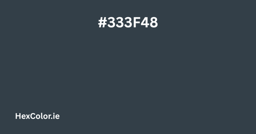
The color #333F48 is a rich, dark blue-gray that exudes a sense of sophistication and depth. It’s a versatile shade that works well in design, fashion, and branding, offering a muted yet impactful presence. Below, we’ll explore its technical details, visual characteristics, and practical applications in a simple, engaging way.
Breaking Down #333F48
Basic Color Information
- Hex Code: #333F48
- RGB Values: (51, 63, 72)
- CMYK Values: (29%, 13%, 0%, 72%)
- HSL (Hue, Saturation, Lightness): (206°, 17%, 24%)
- HSV (Hue, Saturation, Value): (206°, 29%, 28%)
This color is primarily a dark bluish-gray, leaning toward a deep slate tone. It’s not too bright or flashy, making it an excellent choice for professional and minimalist designs.
What Does #333F48 Look Like?
Imagine the color of a stormy evening sky just before nightfall—deep, moody, and slightly cool. #333F48 has a subtle blue undertone, giving it a refined and modern feel.
- Compared to Black: It’s softer than pure black (#000000), making it less harsh in design.
- Compared to Navy: It’s darker and grayer than classic navy blue (#000080).
- Compared to Charcoal: It has more blue than a neutral charcoal gray (#36454F).
This makes it a great alternative to black when you want something with more depth and character.
Shades & Tints of #333F48
Like any color, #333F48 can be lightened (tints) or darkened (shades) to create variations:
Darker Shades (More Moody & Intense)
- #2D3840 – A deeper, slightly more muted version.
- #232C32 – Almost black but retains a hint of blue.
- #191F24 – Nearly black, ideal for dark UI backgrounds.
Lighter Tints (Softer & Airier)
- #47525A – A more medium gray-blue.
- #5B656C – Lighter, with a more neutral feel.
- #848B91 – A soft, muted gray with a touch of blue.
These variations allow designers to create smooth gradients or layered color schemes.
How to Use #333F48 in Design
This color works well in multiple contexts:
1. Professional Branding & Business
- Corporate Logos: Its seriousness makes it ideal for finance, tech, or law firms.
- Business Cards & Stationery: Paired with white or gold, it looks luxurious.
2. Web & UI Design
- Dark Mode Backgrounds: Easier on the eyes than pure black.
- Text & Headers: Provides strong contrast on light backgrounds.
3. Fashion & Interior Design
- Clothing: Works as a refined alternative to black in suits and coats.
- Home Décor: Creates a cozy, moody atmosphere in living spaces.
4. Color Combinations
- With White (#FFFFFF): Clean, modern, and high-contrast.
- With Gold (#FFD700): Adds elegance and luxury.
- With Light Gray (#CCCCCC): Subtle and professional.
- With Teal (#008080): A striking, contemporary contrast.
Psychological Impact of #333F48
Colors influence emotions, and #333F48 is no exception:
- Trust & Stability: Its deep tone conveys reliability.
- Sophistication: Feels upscale and polished.
- Calmness: The blue undertone adds a soothing effect.
It’s perfect for brands that want to appear authoritative yet approachable.
Technical Uses in Web & Print
CSS & Digital Design
css
.primary-color {
  color: #333F48;
}
.background-dark {
  background-color: #333F48;
}
Print & CMYK Adjustments
Since CMYK (used in printing) can dull colors slightly, you may need to adjust the saturation to keep the richness.
Final Thoughts
#333F48 is a timeless, versatile color that balances professionalism with subtle elegance. Whether you’re designing a website, branding a business, or decorating a space, this shade offers depth and sophistication without being overwhelming.


