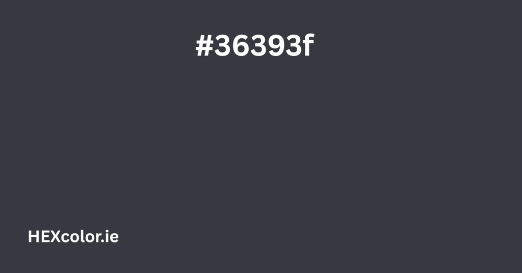
When it comes to design, fashion, or art, choosing the right color can make a huge difference. One such unique color is #36393f, known as Artist’s Charcoal. This color has a deep, dark tone that instantly gives off a modern, cool, and mysterious vibe. It’s perfect for people who love minimalist and clean aesthetics.
Let’s take a closer look at what makes this color special, how it can be used, and what color combinations work well with it.
What Is #36393f?
The hex color code #36393f represents a dark grayish-blue shade. It’s cool in tone and gives off a feeling of depth and calmness. If you’ve ever seen soft charcoal used for sketching, this color closely resembles that — dark, soft, and slightly dusty.
The name Artist’s Charcoal fits well because this color has an artistic and natural feel. It’s not too bold, yet it doesn’t fade into the background. It stands out without being loud.
Color Profile and Conversions
To understand this color better, let’s look at its color codes:
- Hex Code: #36393f
- RGB: (54, 57, 63)
- HSL: (220°, 8%, 23%)
- HSV: (220°, 14%, 25%)
- Closest Tailwind CSS Color:
gray-800
These values show us that this color is low in brightness and saturation, which means it’s dark and muted. That’s why it creates a calming and serious mood.
What Does This Color Feel Like?
#36393f gives off a mature and professional tone. It feels:
- Modern: Ideal for websites, apps, and branding that want a sleek and up-to-date look.
- Mysterious: The darkness adds a layer of intrigue and sophistication.
- Minimalist: Simple yet powerful, it fits perfectly in minimalist design trends.
- Neutral: While it’s a bit cool-toned, it works well with many other colors.
This color is perfect when you want to create a stylish and quiet atmosphere — whether in graphic design, fashion, home decor, or branding.
Tints and Shades of #36393f
Let’s see how this color looks when made lighter (tints) or darker (shades):
Tints (Lighter Versions)
As you add white to #36393f, you get these colors:
- #474a50
- #5a5c61
- #6d6f74
- #808286
- #949699
- #a8aaad
- #bdbfc1
- #d3d4d5
- #e9e9ea
These lighter tints can be used as background colors or secondary colors in a design. They help create depth while keeping a consistent palette.
Shades (Darker Versions)
By adding black, we get:
- #2e3035
- #25282c
- #1e1f23
- #16171b
- #0f1012
- #08090a
- #030404
- #000000
These are very dark and are great for creating contrast or adding a dramatic effect.
Desaturated and Hue Variations
Desaturating #36393f gives you more neutral grays. These work well if you want a more “washed out” or balanced tone. Here are some examples:
- #3d4045
- #44464b
- #4b4d52
- #525458
- #5a5b5f
Changing the hue slightly gives you different versions while staying close to the original color:
- #3f363c
- #3a363f
- #37363f
- #363f3a
- #363f36
These are great if you want variety without stepping too far from the original tone.
Complementary and Related Color Combos
To create balanced designs, you can use color theory to match this color with others.
Complementary Color
The opposite color on the color wheel is:
- #3f3c36 – a warm, earthy brownish-gray
This combo creates contrast and balance. Great for text and background pairing.
Analogous Colors
Colors next to it on the wheel:
- #363d3f
- #363b3f
These colors give a calm and smooth transition, perfect for subtle designs.
Split-Complementary
Use #3e363f and #3d3f36. These colors add interest without being jarring.
Triadic Colors
Using a triangle across the wheel:
- #3f3639
- #393f36
- These bring a more playful but still balanced contrast.
Tetradic Colors
Use four colors in a square format:
- #3f363d
- #3f3c36
- #363f37
This gives more complexity and depth to your color scheme.
Where to Use #36393f
This color is very versatile. You can use it in:
Web Design
- Ideal for background color
- Works great with light text (white or light gray)
- Gives a professional and modern vibe
Graphic Design
- Use in logos, banners, or UI components
- Blends well with accent colors like orange, pink, or blue
Interior Design
- Looks great on walls or furniture in modern homes
- Pairs beautifully with wood, glass, or metallic finishes
Fashion
- Often used in winter and fall collections
- Matches well with both bright and neutral clothing items
Accessibility and Contrast
Contrast matters in design — especially for readability. Let’s test #36393f on different backgrounds:
- On White: Excellent contrast. Text looks sharp and easy to read.
- On Black: Fails contrast test. The color blends into the black, making text hard to read.
For best results, use #36393f over light backgrounds or pair it with lighter shades for balance.
Sample Color Palettes with #36393f
Here are some ready-made color palettes that include #36393f:
- Modern Moody
- #090f0e
- #36393f
- #646975
- #ef5888
- #ffa42a
- Tech Cool
- #36393f
- #c0ceff
- #e2e0e8
- #121314
- Soft Urban
- #36393f
- #3a3543
- #f1f0f4
- #ffa42a
These palettes are great for creating clean, modern, and appealing visuals.
Final Thoughts
The color #36393f is not just another shade of gray. It’s deep, thoughtful, and highly adaptable. Whether you’re designing a website, decorating a room, or building a brand, this color can help you convey seriousness, elegance, and style. It plays well with both vibrant and muted tones and stands strong on its own.


