
If you’ve ever come across the color code #6a5acd, you’ve seen the beautiful and stylish shade called SlateBlue. It’s a soft mix of blue and violet, giving it a unique character that feels both calm and creative. Whether you’re designing a website, picking a paint color, or choosing a color scheme for a graphic, SlateBlue offers something special. Let’s break it down in simple, friendly terms and explore everything about this lovely color.
What Is SlateBlue (#6a5acd)?
SlateBlue is a medium-dark shade of blue with hints of purple. It gets its name because it resembles the color of slate rock combined with a soft purplish tone. The hexadecimal color code #6a5acd stands for its red, green, and blue (RGB) values:
- Red: 106
- Green: 90
- Blue: 205
Together, these values create a balanced blend that leans more toward blue but still has a noticeable purple touch.
How It Looks in Different Color Models
Besides RGB, colors can be expressed in other formats. Let’s look at how SlateBlue appears across some popular models:
- HSL (Hue, Saturation, Lightness):
Hue: 0.69
Saturation: 0.53
Lightness: 0.58
This means it’s slightly on the purple side of the color wheel with a nice level of brightness. - HSV (Hue, Saturation, Value):
Hue: 248°
Saturation: 56%
Value: 80%
This shows that SlateBlue is bright but not overly flashy. - CMYK (Cyan, Magenta, Yellow, Black):
48% Cyan
56% Magenta
0% Yellow
20% Black
This is mainly useful for printing purposes.
Is SlateBlue Mostly Blue or Purple?
Though the name includes “blue,” SlateBlue sits in between blue and purple. It’s a color that adds richness and depth to a design without being overwhelming. In most cases, people see it as more blue, but the purple influence gives it a calm, creative feel.
Web Safe and Accessibility
The web-safe version of #6a5acd is #6666cc. That means if you’re using very old browsers or displays, this similar color might be shown instead. It’s still a lovely match.
If you’re using SlateBlue in text or design elements, make sure there’s enough contrast, especially on light or dark backgrounds. For example:
- On a white background, SlateBlue looks soft and stylish.
- On a black background, it stands out more dramatically.
Shades and Tints of SlateBlue
Colors can be adjusted to be darker (shades) or lighter (tints). Here are some variations of SlateBlue:
Shades (darker versions):
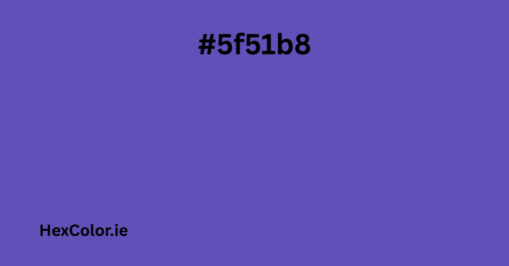
- #5f51b8
- #4a3e8f
- #2a2452
- #000000 (pure black)
Tints (lighter versions):
- #877ad7
- #a59ce1
- #d2cdf0
- #ffffff (pure white)
You can use these tones to create beautiful gradients or to match different moods.
Related Color Combinations
To make the most of SlateBlue in your designs, you can pair it with other colors in different schemes:
- Triadic Colors:
These are evenly spaced on the color wheel. For SlateBlue, triadic matches include:- #cd6a5a (warm red-orange)
- #5acd6a (fresh green)
- Analogous Colors:
These sit next to SlateBlue on the color wheel:- #a45acd (a more violet tone)
- #5a84cd (softer blue tone)
- Complementary Color:
The opposite of SlateBlue is #bdcd5a, a muted greenish-yellow that brings strong contrast.
These combinations work well in websites, branding, and even home decor.
CSS and HTML Usage
If you’re a web designer or developer, using SlateBlue in your code is very easy. Here are a few examples:
Text Color:
htmlCopyEdit<p style="color:#6a5acd">This text is SlateBlue</p>
Background Color:
htmlCopyEdit<div style="background-color:#6a5acd">This div has a SlateBlue background</div>
Border Color:
htmlCopyEdit<div style="border:3px solid #6a5acd">This has a SlateBlue border</div>
Text Shadow Example:
htmlCopyEdit<p style="text-shadow: 4px 4px 2px #6a5acd">Text with SlateBlue shadow</p>
Box Shadow Example:
htmlCopyEdit<div style="box-shadow: 1px 1px 3px 2px #6a5acd;">Box with shadow</div>
These examples help you add style and personality to your webpages using SlateBlue.
Where SlateBlue Is Used
SlateBlue is often used in:
- Web design for buttons, menus, or accent text
- Graphic design to create calm yet eye-catching visuals
- Fashion especially in evening wear and accessories
- Interior design for painting walls or furniture when aiming for a modern, cool look
- Art and illustrations to add mystery or elegance
Its purple undertone gives it a slightly royal and dreamy quality, making it great for both professional and creative projects.
Fun Facts and Palettes
SlateBlue is a favorite among people who like cool-toned, relaxing colors. It’s often found in palettes like:
- “Purples V1”
- “SherryJack”
- “Architecture MediumSlateBlue to SteelBlue”
- “Good Combination Isn’t It”
These palettes combine SlateBlue with other tones like lavender, soft gray, or pale blue for a clean and stylish look.
Final Thoughts
The color #6a5acd, or SlateBlue, is a beautiful mix of calmness and creativity. It blends blue and purple in just the right amounts to give off a peaceful yet bold look. It’s perfect for digital designs, websites, fashion, and even home decoration.
Whether you’re a designer, a developer, or just someone who loves colors, SlateBlue is a versatile choice that brings a cool, modern feel to any project.
If you’re looking for a way to stand out without being too bright or flashy, SlateBlue might be the perfect shade for you.

