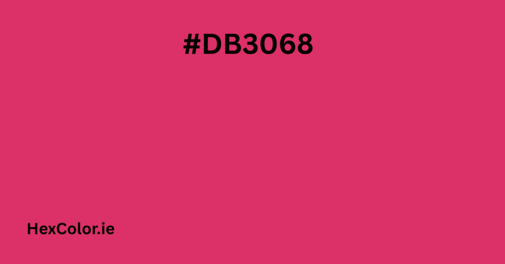
Color is more than just what we see — it’s a feeling, a mood, and a message. One of the colors that truly stands out for its energy and emotion is #db3068. This is a bold, vibrant shade that falls between pink and red. It grabs attention and adds personality to any design or setting.
In this article, we will talk in simple words about what #db3068 looks like, its color values, how it makes us feel, and where you can use it in design, fashion, or daily life.
What Color is #db3068?
The hex code #db3068 is a rich, reddish-pink color. It’s energetic like red but softer because of the pink tones. It looks bold, warm, and expressive.
Let’s break down the color:
- Hex Code: #db3068
- RGB Values:
Red = 219
Green = 48
Blue = 104 - HSL (Hue, Saturation, Lightness):
Hue: 340°
Saturation: 70%
Lightness: 52% - CMYK (Cyan, Magenta, Yellow, Black):
0%, 78%, 53%, 14%
How the Color Feels – The Mood of #db3068
Color can affect how we feel. The shade #db3068 is warm, energetic, and emotional.
Emotions This Color Gives:
- Boldness: This color is not shy. It makes a statement.
- Romance: Like many pink and red shades, it feels romantic and passionate.
- Creativity: Its vibrance can spark creative thoughts and ideas.
- Youthfulness: This bright pinkish-red looks fresh and fun.
- Confidence: It gives off a feeling of courage and strength.
This color is great for grabbing attention and expressing joy, love, and strong emotions.
Where Do We See This Color in Nature or Life?
While this exact color isn’t common in nature, we do see it in places like:
- Flowers – Some roses, tulips, or hibiscus flowers have this shade.
- Fruit – Raspberries, cherries, or watermelon flesh sometimes show similar tones.
- Sunsets – Sometimes the sky turns shades like this when the sun goes down.
In life and design, it’s often used in:
- Fashion brands and makeup.
- Art, modern posters, and graphic design.
- Valentine’s Day themes.
- Branding for fun or luxury products.
How to Use #db3068 in Design
This color is ideal for making something stand out. It’s not soft or neutral — it’s strong and expressive.
In Web Design:
Use #db3068 to:
- Highlight buttons, links, or call-to-action sections.
- Add energy to headers and titles.
- Make a statement background for sections.
In Graphic Design:
- Perfect for youth brands, beauty products, or modern advertising.
- Works well for posters, packaging, and product labels.
In Fashion:
- This color looks stylish in dresses, lipstick, and accessories.
- It pairs well with black, white, and gold for a high-impact look.
- It gives a pop of color without being too aggressive.
In Home Decor:
- As an accent on cushions or artwork, it adds fun and warmth.
- Combine with neutral tones like cream or gray to balance it out.
- Great for kids’ rooms or creative spaces.
Color Combinations with #db3068
When working with a bold color like this, it helps to know what other colors look good with it.
Complementary Color:
- #30db99 – A soft greenish-teal shade. It contrasts beautifully and adds freshness.
Analogous Colors:
- #db3044 – A reddish shade closer to red.
- #db308c – A shade more pinkish than #db3068.
These create harmony and work well together.
Triadic Colors:
- #db3068, #68db30 (green), and #3068db (blue)
This combination is colorful and balanced.
Neutral Pairings:
- White, black, gray, and beige all go well with this color.
- Gold or silver can add a touch of elegance.
Technical Details for Developers (CSS Use)
Want to use this color on your website or app? Here are some useful CSS examples:
cssCopyEdit/* Background color */
.bg-db3068 {
  background-color: #db3068;
}

/* Text color */
.text-db3068 {
  color: #db3068;
}

/* Border */
.border-db3068 {
  border: 2px solid #db3068;
}

/* Button style */
.button-db3068 {
  background-color: #db3068;
  color: white;
  padding: 10px 15px;
  border: none;
  border-radius: 5px;
  cursor: pointer;
}

/* Box shadow with this color */
.shadow-db3068 {
  box-shadow: 2px 2px 8px rgba(219, 48, 104, 0.5);
}
These styles work well for both mobile and desktop websites.
Similar Shades to Explore
If you like this color, you may also want to try similar shades:
- #e91e63 – A bright pink used often in material design.
- #c2185b – A deeper pink, more dramatic and rich.
- #f06292 – A lighter, more playful pink.
- #b71c1c – A strong deep red with attitude.
Final Thoughts
The color #db3068 is exciting, modern, and full of personality. It’s a mix of passion and playfulness, making it ideal for creative and stylish designs. Whether you’re creating a website, designing fashion pieces, or decorating a space, this color adds energy and emotion.
It’s perfect for moments where you want your design to stand out and express confidence, creativity, or love. Use it smartly, pair it well, and let it speak for you.
If you want a color that is bold, elegant, and fun all at once, #db3068 might just be the perfect choice.


