The Psychology of Colors
Colors play a powerful role in shaping our emotions, perceptions, and decisions. They communicate messages, evoke feelings, and even influence behavior, making them an integral part of art, branding, and everyday life. Understanding the psychology of colors can help designers, marketers, and individuals make informed choices that resonate deeply with their audience.
This article explores how different shades influence emotions and perceptions, with real-world examples and practical tips for using colors effectively.
Content
What Is Color Psychology?
Color psychology studies how colors impact human behavior, mood, and perception. It is rooted in both biological responses and cultural associations. For example, red may trigger feelings of passion or urgency, while blue often conveys calmness and trust.
While the meaning of colors can vary across cultures, certain psychological reactions are universal due to evolutionary reasons. For instance, the color green is often associated with nature and safety, a connection that likely evolved from our ancestors relying on greenery for survival.
Colors and Their Psychological Effects
Red: Passion, Energy, and Urgency
Red is one of the most emotionally intense colors. It is often linked to:
- Love and Passion: Red roses and hearts symbolize romance.
- Urgency: Retailers use red to create urgency in sales, such as “Limited Time Offer” signs.
- Power: Red is frequently associated with power, as seen in red carpets and executive ties.
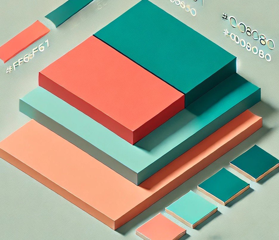
Hex Codes:
- Bright Red: #FF0000
- Crimson: #DC143C
- Firebrick: #B22222
Usage Tip: Use red sparingly in design to draw attention to important elements, such as call-to-action buttons or warnings.
Blue: Trust, Calmness, and Reliability
Blue is a calming and stabilizing color that fosters trust and reliability. It is frequently used in:
- Corporate Branding: Companies like Facebook (#1877F2) and LinkedIn (#0077B5) use blue to signify professionalism and trust.
- Healthcare: Many hospitals and clinics incorporate blue to create a calming environment.
Hex Codes:
- Sky Blue: #87CEEB
- Navy Blue: #000080
- Royal Blue: #4169E1
Usage Tip: Incorporate blue in designs for financial or medical institutions to instill confidence.
Yellow: Optimism, Happiness, and Attention
Yellow is a cheerful and energetic color that grabs attention but can also signify caution.
- Happiness: Often used in emojis and children’s products.
- Caution: Yellow road signs and hazard warnings.
Hex Codes:
- Sunflower: #FFC300
- Lemon: #FFF700
- Goldenrod: #DAA520
Usage Tip: Use yellow to convey optimism but pair it with neutral tones to avoid overwhelming the viewer.
Green: Growth, Harmony, and Health
Green is synonymous with nature, growth, and balance. It is a versatile color used in:
- Environmental Branding: Brands like Whole Foods (#007A33) use green to emphasize sustainability.
- Finance: Green symbolizes prosperity and is associated with money.
Hex Codes:
- Forest Green: #228B22
- Lime Green: #32CD32
- Olive Green: #808000
Usage Tip: Incorporate green in designs for eco-friendly products or to create a calming effect.
Purple: Creativity, Royalty, and Luxury
Purple combines the stability of blue and the energy of red. It signifies:
- Luxury: Often used in high-end products, such as Cadbury’s iconic purple (#4B0082).
- Creativity: Purple stimulates imagination and is popular in artistic industries.
Hex Codes:
- Lavender: #E6E6FA
- Deep Purple: #800080
- Orchid: #DA70D6
Usage Tip: Use purple in branding to appeal to creative or luxury-seeking audiences.
Orange: Warmth, Enthusiasm, and Playfulness
Orange is a vibrant and energetic color often used to:
- Encourage Action: Common in call-to-action buttons and sports brands.
- Convey Playfulness: Ideal for kids’ products and entertainment industries.
Hex Codes:
- Tangerine: #FFA07A
- Burnt Orange: #CC5500
- Coral: #FF7F50
Usage Tip: Use orange in moderation to convey enthusiasm without appearing overwhelming.
Black: Sophistication, Power, and Mystery
Black is a timeless color that exudes elegance and mystery. It is often used for:
- Luxury Brands: Chanel and Prada utilize black to signify exclusivity.
- Formal Events: Black tie affairs symbolize sophistication.
Hex Codes:
- Jet Black: #000000
- Charcoal: #36454F
- Onyx: #353839
Usage Tip: Combine black with metallic colors like gold (#FFD700) for a luxurious appeal.
White: Simplicity, Purity, and Cleanliness
White is a clean and neutral color often associated with:
- Minimalism: Apple’s branding heavily incorporates white for a sleek, modern look.
- Healthcare: White coats and sterile environments signify purity.
Hex Codes:
- Snow: #FFFAFA
- Ivory: #FFFFF0
- Ghost White: #F8F8FF
Usage Tip: Pair white with bold colors to create striking contrasts.
Cultural Variations in Color Perception
While certain color associations are universal, others are deeply rooted in culture:
- Red: In China, red symbolizes prosperity and luck, while in Western cultures, it may signify danger or romance.
- White: In Western cultures, white represents purity, while in some Eastern cultures, it is associated with mourning.
- Yellow: In India, yellow is considered auspicious and sacred, whereas in Western contexts, it represents happiness.
Tip: Research the cultural significance of colors when designing for global audiences.
Practical Tips for Using Colors Effectively
- Know Your Audience: Choose colors that align with your target demographic’s preferences and cultural context.
- Balance the Palette: Use complementary colors to create harmony and avoid overwhelming the viewer.
- Test for Accessibility: Ensure sufficient contrast between text and background colors for readability.
- Consider Color Psychology: Use colors strategically to evoke desired emotions and actions.
- Stay Consistent: Maintain a cohesive color scheme to strengthen brand identity.
Tools for Choosing and Testing Colors
- Coolors: Generate color palettes and test combinations.
- Adobe Color: Explore color harmonies and trends.
- Color Contrast Checker: Ensure accessibility compliance for text and background.
Conclusion
Understanding the psychology of colors unlocks endless possibilities for creating impactful designs and messages. Whether you’re designing a website, crafting a marketing campaign, or choosing an outfit, the right color choices can significantly influence perceptions and emotions. Use the insights shared in this article to harness the power of colors effectively and make informed design decisions.
Want more tips on using colors effectively? Explore our tools and resources at HexColor.ie!