Web design trends constantly evolve, and 2024 is shaping up to be a year of bold, dynamic, and user-focused color palettes. Colors play a crucial role in user experience (UX), influencing mood, navigation, and engagement. Whether you’re a seasoned designer or a beginner, understanding the trending colors will help you create visually compelling and effective designs.
In this article, we explore the top color trends for web design in 2024, complete with hex codes and examples for practical application.
Content
Why Color Trends Matter in Web Design
Colors are more than just aesthetics; they are vital in:
- Building Brand Identity: Consistent use of colors enhances brand recognition.
- Enhancing User Experience: Colors can guide users, highlight actions, and convey messages.
- Evoking Emotions: Different colors trigger specific psychological responses.
Staying updated with color trends ensures your designs feel modern, relevant, and appealing.
1. Digital Lavender (#CC99FF)
Digital Lavender is predicted to dominate in 2024 as a calming yet futuristic shade. It reflects the balance between technology and wellness, making it ideal for:
- Wellness and health websites.
- Tech startups seeking a soft, approachable look.
Usage Tip: Pair Digital Lavender with neutral shades like white (#FFFFFF) or soft grays (#D3D3D3) for a modern and calming design.
Examples:
- Meditation apps using Digital Lavender for backgrounds to evoke tranquility.
- E-commerce sites focusing on self-care products with lavender accents.
2. Deep Sea Teal (#005F6B)
Deep Sea Teal combines the tranquility of blue with the depth of green, creating a sophisticated yet inviting hue. This color is perfect for:
- Finance and corporate websites.
- Sustainable and eco-conscious brands.
Usage Tip: Use Deep Sea Teal as a background color with lighter accents like pastel green (#A1E8AF) or beige (#F5F5DC).
Examples:
- A fintech startup’s homepage featuring Deep Sea Teal for trustworthiness.
- Environmental advocacy websites using teal and green gradients.
3. Radiant Orange (#FF6700)
Radiant Orange is vibrant, energetic, and eye-catching. It’s an excellent choice for:
- Call-to-action buttons.
- Sports or entertainment websites.
- Highlighting important elements.
Usage Tip: Combine Radiant Orange with complementary colors like dark blue (#00008B) or white (#FFFFFF) for maximum impact.
Examples:
- Streaming platforms using Radiant Orange for play buttons.
- Sportswear brands highlighting promotional banners with this vibrant hue.
4. Arctic Frost (#E0F7FA)
Arctic Frost is a subtle icy blue that conveys calmness and clarity. Its minimalist appeal makes it ideal for:
- E-commerce sites focused on luxury or technology.
- Websites that emphasize simplicity and elegance.
Usage Tip: Use Arctic Frost as a background or accent color with bold shades like navy blue (#001F3F) or charcoal gray (#36454F).
Examples:
- High-end tech gadgets’ landing pages using Arctic Frost for clean aesthetics.
- Minimalist portfolios that balance Arctic Frost with bold typography.
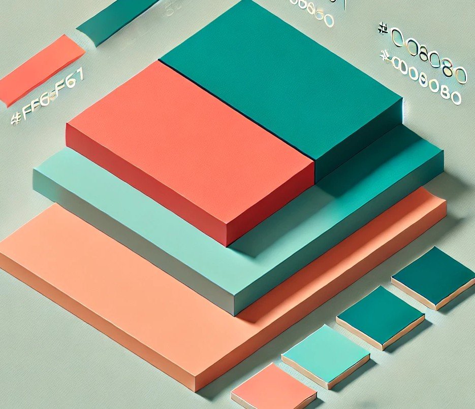
5. Vivid Coral (#FF6F61)
Vivid Coral strikes a balance between boldness and warmth. It’s excellent for:
- Creative agencies.
- Travel and hospitality websites.
- Highlighting headers or navigation bars.
Usage Tip: Pair Vivid Coral with muted tones like sand (#F4A460) or light gray (#DCDCDC) for a harmonious effect.
Examples:
- Travel blogs using Vivid Coral for header backgrounds to convey adventure.
- Hotels featuring coral-accented navigation menus.
6. Muted Earth Tones
Muted earth tones like Olive Green (#708238), Clay Brown (#B87333), and Desert Sand (#EDC9AF) are trending for their organic and grounded feel. These colors are ideal for:
- Nature-focused brands.
- Home decor and lifestyle websites.
Usage Tip: Use these tones as backgrounds or secondary colors to evoke warmth and authenticity.
Examples:
- Lifestyle blogs showcasing eco-friendly interiors with earthy palettes.
- Outdoor adventure sites incorporating earthy tones for credibility.
7. Gradient Combinations
Gradients are making a comeback with modern twists. Popular combinations include:
- Sunset Glow: Orange (#FF6700) to Pink (#FF1493).
- Ocean Wave: Teal (#005F6B) to Light Blue (#ADD8E6).
Usage Tip: Use gradients in hero sections or as backgrounds for buttons to create a dynamic and engaging design.
Examples:
- Music streaming services using gradients for album covers.
- Fitness apps featuring gradient transitions in progress bars.
8. Neo Mint (#98FF98)
Neo Mint is a fresh, invigorating shade that’s perfect for futuristic and tech-savvy designs. It works well for:
- Innovative tech products.
- Youth-focused brands.
Usage Tip: Pair Neo Mint with monochromatic tones or metallic accents like silver (#C0C0C0).
Examples:
- Tech blogs using Neo Mint to highlight innovations.
- Fashion e-commerce websites targeting Gen Z consumers.
9. Bold Monochromatic Schemes
Using variations of a single color creates a cohesive yet striking effect. Popular choices for 2024 include:
- Blues (#87CEFA, #4682B4, #001F3F).
- Reds (#FF4500, #B22222, #8B0000).
Usage Tip: Use darker shades for backgrounds and lighter tones for text or accents.
Examples:
- Corporate websites using monochromatic blues for professional appeal.
- Event pages featuring monochromatic reds for energy and passion.
10. Dark Mode Optimized Colors
With the rise of dark mode, designers are opting for colors that stand out against dark backgrounds. Trending shades include:
- Electric Blue (#7DF9FF).
- Neon Green (#39FF14).
- Hot Pink (#FF69B4).
Usage Tip: Use these colors sparingly as highlights or accents to avoid overpowering the design.
Examples:
- Messaging apps incorporating electric blue for notifications.
- Gaming websites using neon accents for futuristic effects.
Expanding on Accessibility
Accessibility is not just a trend but a necessity. Colors must be:
- Readable: Ensure text contrasts well against the background.
- Tested for Color Blindness: Use tools like Coblis to check designs.
- Inclusive: Provide alternatives for users with vision impairments.
Practical Tools:
- WebAIM Contrast Checker: Validate color contrast ratios.
- Toptal Color Filter: Simulate how your site appears to colorblind users.
Practical Tips for Using Color Trends
- Keep Accessibility in Mind:
- Use contrast checkers to ensure readability.
- Avoid overly bright colors that strain the eyes.
- Test Across Devices:
- Colors may appear differently on screens; always test on multiple devices.
- Use Tools for Inspiration:
- Coolors: For generating palettes.
- Adobe Color: For exploring color harmonies.
- Stay Consistent:
- Align color choices with your brand’s identity and message.
- Incorporate Feedback:
- Share mockups with diverse audiences for input on color choices.
Conclusion
The top color trends for web design in 2024 emphasize bold choices, calming tones, and dynamic gradients. By incorporating these trends, designers can create visually appealing websites that resonate with users and stay ahead of the curve. Whether you’re designing for a corporate client or a creative project, these colors offer endless possibilities to elevate your work.
With the right tools, attention to accessibility, and a keen eye for emerging trends, your designs can stand out in a competitive digital landscape.
Discover more color inspiration and tools at HexColor.ie!