Discovering unique and unusual color combinations can transform your design projects and make them stand out in a crowded visual space. While traditional palettes are timeless, breaking the mold with unexpected hues can bring fresh energy to your work.
In this article, we explore some striking color pairings that not only work but elevate your creativity. Whether you’re designing for digital platforms, interiors, or fashion, these combinations offer inspiration and practical tips to captivate your audience. Use tools like the Contrast Checker and Image Color Palette Extractor to refine your choices and ensure accessibility.
The Psychology of Color Combinations
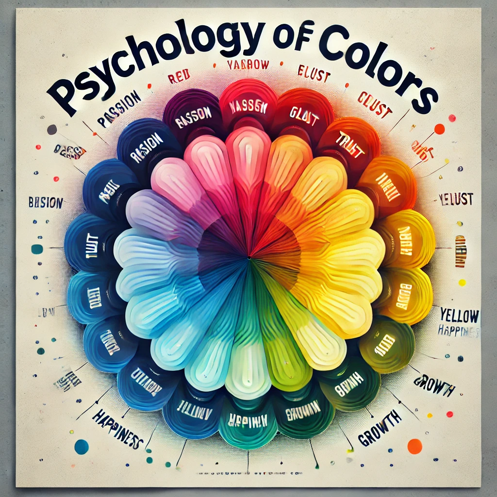
Color is more than just an aesthetic choice; it influences perception, mood, and behavior. Understanding the psychological impact of different hues can help you craft combinations that resonate with your audience. For example:
- Yellow and Gray: A blend of optimism and resilience, often used to convey modernity and warmth.
- Blue and Orange: Evoking energy and balance, this complementary duo is both bold and inviting.
- Pink and Green: Associated with freshness and vibrancy, this pairing adds a playful twist to designs.
Deep Dive into Color Psychology
- Purple and Gold: Often associated with luxury, wisdom, and sophistication. This combination is excellent for branding high-end products or services.
- Black and White with a Pop of Color: A classic pairing that conveys elegance and simplicity. Adding a vibrant accent color like red or neon green creates a striking effect.
- Soft Pastels: Think lavender with pale peach, evoking calmness and serenity. Perfect for wellness and lifestyle industries.
Understanding these psychological impacts allows designers to craft color combinations that tell a story and evoke the desired emotions in their audience.
Adding Cultural Contexts to Color Choices
Colors carry different meanings across cultures. For example:
- White: Symbolizes purity in Western cultures but is associated with mourning in parts of Asia.
- Red: Represents luck and prosperity in China but can signify danger in Western design.
- Green: Often tied to nature and growth but may carry religious connotations in certain regions.
Understanding these nuances ensures your color combinations resonate globally.
10 Unusual Color Combinations That Work
Here are ten unexpected yet effective pairings to inspire your next project:
Turquoise and Red: This vivid mix strikes a balance between tranquility and passion. Use it in branding to create a bold statement.
- Example: A red logo on a turquoise background creates a dynamic visual impact.
Olive Green and Lavender: A sophisticated duo that combines earthy tones with a soft pastel hue. Ideal for interiors and lifestyle branding.
Mustard Yellow and Teal: These contrasting shades add a retro vibe and are perfect for modern graphic design.
Navy and Coral: A nautical-inspired combination that’s both vibrant and elegant. Use it for websites or event themes.
Rust Orange and Aqua Blue: This earthy yet refreshing pairing works beautifully in fashion and editorial layouts.
Blush Pink and Charcoal: A romantic and grounded duo perfect for weddings, beauty products, or lifestyle blogs.
Chartreuse and Fuchsia: A daring combination that’s bold and playful. It’s ideal for youthful, energetic designs.
Maroon and Mint Green: A rich, vintage-inspired pairing that works well in packaging and stationery.
Indigo and Gold: Luxurious and timeless, this pairing is ideal for high-end branding and invitations.
Cobalt Blue and Neon Yellow: High-energy and attention-grabbing, this combination is perfect for sports and tech designs.
Additional Pairings for Specific Industries
- Beige and Burgundy: Ideal for wine brands and luxury goods.
- Electric Purple and Lime Green: Captures attention in tech and gaming industries.
- Peach and Aqua: Evokes a fresh, tropical vibe suitable for travel and hospitality.
Accessibility Matters
When experimenting with unusual color combinations, ensuring accessibility is crucial. Contrast plays a significant role in readability, especially for digital designs. Use the Contrast Checker to ensure your text and background colors meet accessibility standards.
Why Accessibility is Key
- Inclusive Design: Ensures your content is readable for users with visual impairments.
- Improved Engagement: Clear and accessible color contrasts make it easier for users to interact with your content.
- SEO Benefits: Search engines prioritize accessible websites, improving your rankings.
Advanced Accessibility Considerations
- Color Blindness Simulation: Use tools to preview designs as seen by individuals with color vision deficiencies.
- Interactive Design Testing: Test your color combinations on different devices and under varying lighting conditions to ensure consistency.
Practical Tips for Choosing Unusual Color Combinations
- Start with a Neutral Base: Introduce bold colors gradually by pairing them with neutral shades like white, gray, or beige.
- Use the 60-30-10 Rule: Allocate 60% of your palette to a dominant color, 30% to a secondary hue, and 10% to an accent color.
- Leverage Color Tools: Tools like the Image Color Palette Extractor can help you derive palettes from images and find harmonious pairings.
- Test in Context: Always view your color combinations in the context of your final design to ensure they work cohesively.
- Stay Updated on Trends: Keep an eye on seasonal color trends to inspire fresh combinations.
Avoiding Common Mistakes
- Overloading Colors: Too many bold colors can overwhelm the design.
- Ignoring Contrast: Poor contrast reduces readability and accessibility.
- Following Trends Blindly: Ensure your color combinations align with your brand identity rather than chasing trends.
Real-World Examples
Branding
- Spotify: Their green and black palette, combined with unexpected accent colors, creates a bold yet cohesive brand identity.
- Airbnb: The use of coral pink paired with subtle tones makes their design approachable and unique.
Web Design
- Apple’s iMac Lineup: Showcasing products in pastel combinations to evoke creativity and innovation.
Fashion
- Gucci: The use of fuchsia and emerald green for a bold and luxurious aesthetic.
Interiors
- Modern Homes: Mixing teal walls with mustard yellow furniture for a retro-modern vibe.
Visual Enhancement Tips
- Incorporate Gradients: Gradients can make unusual color combinations feel more cohesive.
- Add Patterns: Patterns featuring multiple hues can harmonize seemingly clashing colors.
- Use Typography: Highlight unusual pairings by applying them to text and backgrounds.
Advanced Techniques
- Overlay Effects: Add transparency layers to blend bold colors subtly.
- Dynamic Transitions: Animate color changes to create an engaging user experience.
- Duotone Effects: Use contrasting hues to highlight elements in photography or web design.
Experimenting with Tools
Tools like Contrast Checker make experimenting with color combinations easy and effective. Use the Contrast Checker to validate your palette’s readability, and the Image Color Palette Extractor to derive colors from inspirational images or photos.
Step-by-Step Guide for the Tools
- Contrast Checker:
- Enter your text and background colors.
- Ensure a contrast ratio of at least 4.5:1 for normal text and 3:1 for large text.
- Image Color Palette Extractor:
- Upload an image to generate a palette.
- Use the extracted colors to create harmonious combinations for your design.
Interactive Examples
- Palette Creation: Use a photo of a sunset to extract colors and design a warm, cohesive palette.
- Contrast Validation: Test contrasting shades like navy and neon yellow for accessibility in a logo design.
Conclusion
Unusual color combinations have the power to make your designs memorable and impactful. By understanding color psychology, experimenting with bold pairings, and using tools like Contrast Checker and Image Color Palette Extractor, you can create visually stunning and accessible designs. So, don’t be afraid to explore the unconventional—it might just be the key to your next masterpiece.
With the right tools and an understanding of design principles, you can craft palettes that not only capture attention but also create a meaningful connection with your audience.
To make your work even more dynamic, download the example palettes provided here, or use the interactive tools linked above to start experimenting today!
Frequently searched FAQs related to Color Combinations
What are the best color combinations for branding?
Users often search for effective color pairings to create a strong brand identity. You can discuss combinations like navy and coral, turquoise and red, or indigo and gold for their psychological impact and visual appeal.
How do I choose the right color combination for my website?
This query targets website designers. Address topics like color psychology, accessibility (contrast checks), and tools like the Contrast Checker to ensure readability.
What is the 60-30-10 color rule in design?
Explain this popular design principle for creating balanced and harmonious color schemes, using examples like mustard yellow, teal, and charcoal combinations.
Which unusual color combinations work well together?
Address unique pairings like chartreuse and fuchsia, maroon and mint green, or cobalt blue and neon yellow, with real-world examples to illustrate their effectiveness.
What tools can I use to generate color palettes?
Suggest tools like your Image Color Palette Extractor for creating custom palettes and highlight its usefulness in extracting color schemes from images.


