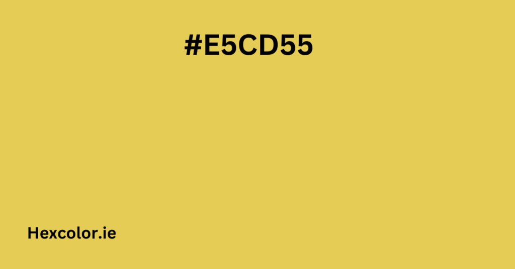
Have you ever admired the rich glow of golden wheat fields, the warmth of soft candlelight, or the elegance of antique gold jewelry? That’s exactly what #e5cd55 hex embodies—a warm, sophisticated shade of soft yellow that brings energy, positivity, and timeless charm.
This color is versatile, stylish, and full of character. Whether you want to use it in fashion, design, home decor, or branding, understanding its qualities, psychology, and best pairings will help you make the most of it.
1. What Makes #e5cd55 Special?
Every color has a unique composition that defines its look and feel. Here’s what makes #e5cd55 stand out:
RGB Breakdown (How it Appears on Screens)
- Red (R): 229 → Creates warmth and vibrancy.
- Green (G): 205 → Adds a natural, earthy touch.
- Blue (B): 85 → Minimal blue keeps it golden and rich.
CMYK Breakdown (How it Prints on Paper)
- Cyan (C): 0% → No coolness, keeping it warm.
- Magenta (M): 10% → A subtle red undertone.
- Yellow (Y): 63% → The dominant element, making it golden.
- Black (K): 10% → Just a hint of depth for balance.
HSL (Hue, Saturation, Lightness)
- Hue: 50° → A classic warm yellow.
- Saturation: 73.5% → Vibrant yet not overwhelming.
- Lightness: 61.6% → Bright but not pastel.
This perfect balance makes #e5cd55 look luxurious yet grounded, energetic yet calming.
2. Psychological Impact – How #e5cd55 Makes You Feel
Colors influence emotions, and #e5cd55 is packed with positive psychological effects:
Warmth & Comfort
It feels like a golden sunset or a cozy cup of tea—soothing and reassuring.
Happiness & Optimism
Similar to sunflowers and honey, this color evokes joy and positivity.
Energy & Creativity
It has an inspiring, youthful, and energetic vibe, perfect for innovation and motivation.
Nature & Earthy Vibes
Reminds us of harvest seasons, golden leaves, and organic materials, making it feel grounded and timeless.
This is why many brands, designers, and artists use #e5cd55 when they want to create a friendly, welcoming, and inspiring atmosphere.
3. Where & How to Use #e5cd55?
Interior Design & Home Decor
- Accent Walls → Adds warmth to living rooms, kitchens, or study areas.
- Furniture & Accessories → Works beautifully in rugs, pillows, and curtains.
- Best Combinations:
- Deep Navy Blue (#2c3e50) → Elegant and bold.
- Warm Earthy Brown (#8b5a2b) → Cozy and rustic.
- Soft White (#f5f5f5) → Clean and airy.
Fashion & Clothing
- Perfect for autumn and summer outfits—a warm yet versatile shade.
- Accessories like handbags, scarves, or shoes make a bold statement.
- Works well with:
- Olive Green (#556b2f) for an earthy, balanced look.
- Burnt Orange (#cc5500) for a vibrant, energetic feel.
- Dark Blue (#1c2833) for a sophisticated contrast.
Graphic & Web Design
- Branding & Logos → Often used in luxury, wellness, and organic product brands.
- Web Design → A great highlight color for buttons, banners, and call-to-actions.
- Text Contrast: Best paired with deep brown, navy blue, or dark gray for readability.
Automobiles & Product Design
- Used in luxury cars, premium packaging, and artistic products for an elegant yet striking appearance.
4. Perfect Color Combinations with #e5cd55
Complementary (Opposite Color for Strong Contrast)
- Best Match: #556de5 (Soft Blue)
- Why? The blue balances the warmth of #e5cd55, creating a dynamic, eye-catching combination.
Analogous (Colors Next to It for a Natural Look)
- Best Matches:
- #e58555 (Burnt Orange) → Warm and energetic.
- #b5e555 (Lime Green) → Fresh and lively.
Triadic (Three Equally Spaced Colors for Bold Designs)
- Best Matches:
- #cd55e5 (Bright Purple) → A striking, modern contrast.
- #55e5cd (Soft Teal) → Adds a cool, refreshing balance.
Monochromatic (Different Shades & Tints for Depth)
- Lighter Shades:
- #f2e6aa (Pastel Yellow) → Soft, dreamy, and airy.
- Darker Shades:
- #ccaf1f (Deep Mustard) → Earthy and rich.
These variations allow for gradients, highlights, and depth in design and fashion.
5. Accessibility – How It Appears to Color-Blind Users
Not everyone perceives colors the same way. Here’s how #e5cd55 appears to people with color vision deficiencies:
- Protanopia & Deuteranopia (Red-Green Blindness): Appears more orange-toned.
- Tritanopia (Blue-Yellow Blindness): Appears duller and more muted.
- Achromatopsia (Total Color Blindness): Appears as a neutral beige-gray.
Tip: To ensure accessibility, pair #e5cd55 with dark blues or deep browns to maintain readability and contrast.
6. Why #e5cd55 is a Premium & Timeless Color?
✔ It’s Luxurious & Elegant → Reminiscent of antique gold, rich honey, and harvest fields.
✔ It’s Warm & Inviting → Perfect for creating a welcoming atmosphere.
✔ It’s Versatile → Works in fashion, interiors, branding, and design.
✔ It’s Naturally Beautiful → Inspired by nature’s golden tones.
✔ It Stands Out Yet Blends Well → Strong enough for highlights but soft enough to be a base color.
This color isn’t just beautiful—it’s powerful, inspiring, and meaningful. Whether you’re designing, decorating, or styling, #e5cd55 is a timeless shade that will always bring warmth, sophistication, and vibrance.
Final Thought: Should You Use #e5cd55?
If you want a color that’s rich, warm, and inviting, it’s a great choice.
If you need something timeless, elegant, and versatile, it works beautifully.
If you’re looking for a color that sparks joy and creativity, it’s highly recommended.
Need help picking the best color combinations for your project? Let me know, and I’ll create a custom palette just for you.


