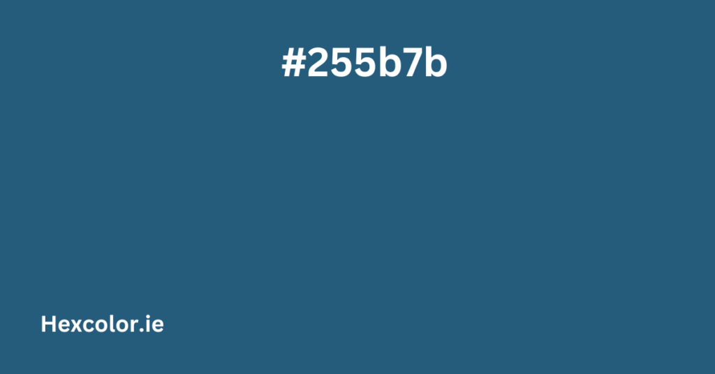
The color #255b7b is a shade of blue with a slight greenish tint, and it’s a pretty cool color overall. Think of it like a calming ocean-blue with a touch of teal. It’s not too bright, and not too dark, making it a nice, balanced tone.
If we dive into the numbers behind the color, we get what’s called the RGB values. That just means the color is made from three basic colors: Red (R), Green (G), and Blue (B). For #255b7b, the breakdown looks like this:
- Red: 37 (out of 255)
- Green: 91 (out of 255)
- Blue: 123 (out of 255)
So, it has a bit of red, a lot of green, and a solid chunk of blue, with blue being the most dominant. That’s why it feels like a blue color with just a hint of green.
What Else About This Color?
The HSL (Hue, Saturation, Lightness) values tell us even more about how this color feels.
- Hue: This color has a 202° hue, which means it’s definitely in the blue part of the color wheel (with a little greenish vibe).
- Saturation: At 54%, it’s fairly intense, but not overwhelmingly so. It’s vibrant but still grounded.
- Lightness: With 31%, this color is a bit on the darker side, but not too dark.
What Does CMYK Mean?
If you’re working in print or design, you might also hear about CMYK, which is how colors are created with ink. For #255b7b, here’s the breakdown:
- Cyan: 70% (pretty high, which is why it’s more on the blue side)
- Magenta: 26% (giving it a touch of purple)
- Yellow: 0% (no yellow here)
- Black: 52% (this adds to the darker tone)
Shades and Tints
Shades and tints are just ways to describe lighter and darker versions of a color. For example, if you add black to #255b7b, you get a shade. One of its darker shades is #21516e, which is a deeper version of the same blue.
On the other hand, adding white to #255b7b gives you tints. A lighter version would be something like #3a6b88—still blue, just softer.
Complementary Colors
If you want colors that look great next to #255b7b, complementary colors are what you’re looking for. These are colors that are opposite each other on the color wheel. For this blue-green color, the complementary color is a warm, orange-brown color: #7b4525. It’s like the perfect color match that really pops when used together.
Using #255b7b in Design
Now, if you’re designing something online or in a graphic editor, #255b7b is super easy to use. Here’s how you might use it in CSS for a website:
- Background: You can set a background color like this:
.mybgcolor { background-color: #255b7b; } - Text: Want to make your text stand out in this shade of blue? Use:
.myforecolor { color: #255b7b; } - Borders: You can also use this color for borders:
.mybordercolor { border: 3px solid #255b7b; }
Adding Effects with #255b7b
If you want to get fancy, you can add shadows to your text or boxes in this color. For example, adding a soft shadow to your text with the #255b7b color could look something like this:
.textShadowRgb {
  text-shadow: 4px 4px 2px rgba(37, 91, 123, 0.8);
}
And if you want to add a subtle shadow to a box or div, you can do it like this:
.divShadow {
  -moz-box-shadow: 1px 1px 3px 2px #255b7b;
  -webkit-box-shadow: 1px 1px 3px 2px #255b7b;
  box-shadow: 1px 1px 3px 2px #255b7b;
}
A Quick Recap
To sum up, #255b7b is a soft but cool blue color with a little bit of green mixed in. It’s versatile, easy to work with, and has a calming, professional vibe. Whether you’re using it for backgrounds, text, or borders in a design, it’s a great color to add to your toolkit.
It also pairs really well with other colors, whether you’re using complementary, triadic, or analogous color schemes. And with all the tints and shades available, you can create a wide range of designs that feel cohesive and balanced.
So, whether you’re designing a website, making some graphics, or just having fun with colors, #255b7b is a solid choice!


