
Color plays a crucial role in design, branding, and user experience. The color #AD6C5E is a warm, earthy tone that blends beautifully into various designs, making it a favorite in fashion, interior decor, and web design. In this article, we’ll explore its characteristics, best uses, and how it aligns with modern design trends and Google’s latest updates for user experience (UX) and SEO.
What is the Color #AD6C5E?
Technical Breakdown
Understanding a color’s technical details helps designers and developers make informed choices. Here’s what you need to know about #AD6C5E:
RGB Representation
RGB stands for Red, Green, and Blue, the primary colors of digital displays. The values for #AD6C5E are:
- Red: 173
- Green: 108
- Blue: 94
This means the color has a strong red presence, giving it a warm and inviting tone.
HSL & CMYK Values
- HSL (Hue, Saturation, Lightness): 11°, 46%, 68%
- CMYK (Print Colors): 0% Cyan, 38% Magenta, 46% Yellow, 32% Black
These values show that #AD6C5E is a muted reddish-brown, making it versatile and natural-looking.
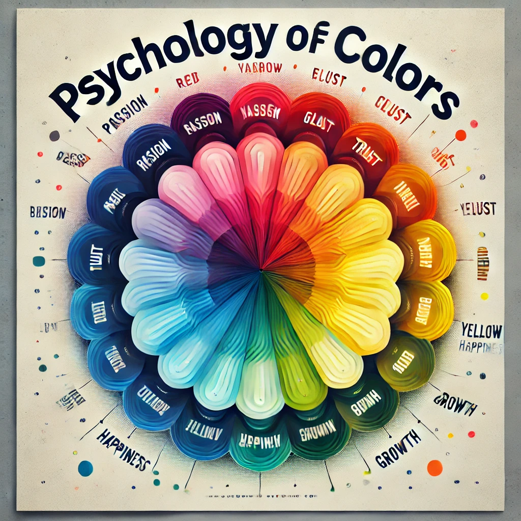
Why #AD6C5E Works Well in UX Design
1. Emotional Impact
Colors affect human emotions. #AD6C5E conveys warmth, reliability, and sophistication. It’s great for brands that want to build trust and create a welcoming experience.
2. Readability and Accessibility
Google’s latest updates emphasize accessibility in UX. When using #AD6C5E, designers should ensure sufficient contrast for readability. Pairing it with white or dark shades improves visibility.
3. SEO-Friendly Color Usage
Search engines prioritize user-friendly designs. Websites that use well-balanced colors like #AD6C5E improve user engagement and reduce bounce rates. This, in turn, can positively impact rankings.
Shades & Tints of #AD6C5E
To create visual depth, designers use shades (darker versions) and tints (lighter versions):
Shades (Darker Tones)
- #9B6154 – A deeper, rustic brown
- #8A564B – Earthy, rich brown
- #794B41 – Dark brick-red
Tints (Lighter Tones)
- #B57A6E – Warm peachy-brown
- #C5988E – Soft beige-pink
- #D6B5AE – Delicate pastel tone
Best Color Combinations for #AD6C5E
1. Complementary Colors (High Contrast)
- #5E9FAD (Muted Teal) – Perfect for contrast
2. Triadic Colors (Balanced Palette)
- #AD6C5E (Warm Brown-Red)
- #5EAD6C (Muted Green)
- #6C5EAD (Dusty Purple)
3. Analogous Colors (Harmonious Tones)
- #AD945E (Warm Gold)
- #AD6C5E (Rich Brown-Red)
- #AD5E78 (Dusty Rose)
How to Use #AD6C5E in Modern Design
1. Website and App Design
- Backgrounds: Use it for warm, inviting layouts.
- Buttons & Borders: Creates soft, natural UI elements.
- Text: Works well for headers, but should be paired with a high-contrast color for readability.
2. Interior Design & Home Decor
- Wall Colors: Adds depth and warmth to spaces.
- Furniture & Accents: Ideal for wooden textures.
- Best Pairings: White, deep greens, and navy blues.
3. Fashion & Branding
- Clothing: Looks great on earthy outfits and leather accessories.
- Logos & Packaging: Creates a premium, vintage feel.
- Best Pairings: Beige, denim blue, and mustard yellow.
SEO-Optimized CSS Code for Web Design
To use #AD6C5E effectively on websites, here are some optimized CSS codes:
Background Color
.mybgcolor {
  background-color: #AD6C5E;
}
Text Color
.myforecolor {
  color: #AD6C5E;
}
Border Color
.mybordercolor {
  border: 3px solid #AD6C5E;
}
Box Shadow for UX Appeal
.divShadow {
  box-shadow: 2px 2px 5px #AD6C5E;
}
Final Thoughts
The color #AD6C5E is a timeless, versatile shade that works across multiple industries. Whether you’re a designer, developer, or business owner, using it effectively can enhance UX, SEO rankings, and brand identity.
For the best results, always consider contrast, accessibility, and color psychology in your design strategy. Happy designing!