When we think of red, we often imagine something bold, strong, and full of energy. But red isn’t just one color. It comes in many shades—from the deepest crimson to the softest blush. Today, let’s take a look at a beautiful Bright to Light Red Color Palette. This palette starts with the brightest reds and slowly shifts into lighter, softer tones. Whether you’re designing a website, painting a room, or just exploring colors, this palette is perfect for creating a warm, eye-catching look.
What Is a Color Palette?
A color palette is a group of colors that go well together. Designers use palettes to make things look good—like websites, logos, art, and even fashion. The Bright to Light Red Color Palette is made up of five different shades of red, from bold to soft. These colors gradually fade from intense red to a very pale, almost white pink.
Colors in the Bright to Light Red Palette
Let’s take a look at each color in this beautiful palette:
1. #ff0000 – Pure Red
This is the strongest, boldest red you can find. It’s bright, full of energy, and grabs attention right away. Pure red is often used to express love, urgency, or excitement. If you want something to stand out, #ff0000 is a great choice.
2. #ff3535 – Bright Cherry Red
This shade is a bit softer than pure red but still very lively. It looks like cherry candy or a ripe apple. #ff3535 is a great pick for adding fun and passion without being too overpowering.
3. #ff8282 – Light Red/Pinkish Red
Now we’re getting into the softer side of red. #ff8282 is a warm, pinkish-red that feels calm and sweet. It’s great for background colors, soft accents, and friendly designs. It brings a cozy and inviting feel to anything you use it in.
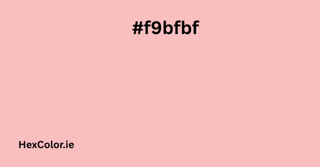
4. #f9bfbf – Soft Rose
This is one of the most gentle colors in the palette. #f9bfbf is a soft rose pink that gives off peaceful and romantic vibes. It works well in beauty products, blogs, and any design that needs a soft touch. It’s also a perfect match for elegant and minimal designs.
5. #ffefef – Almost White with a Pink Tint
This color is very light, almost white, but with a hint of pink. #ffefef is great for backgrounds and subtle highlights. It’s clean, gentle, and creates a calm atmosphere. When paired with deeper reds like #ff0000, it adds balance and contrast.
Why Use a Bright to Light Red Palette?
Here are a few reasons why this palette is so useful and popular:
1. It Grabs Attention
Red is naturally an attention-grabbing color. Using a mix of bright to light reds can guide the eye, highlight important sections, or create emotional impact.
2. It’s Versatile
You can use these colors for anything—from websites to makeup brands, to seasonal promotions. It fits a wide range of moods and themes.
3. It Creates Smooth Transitions
This palette smoothly fades from bold to soft. That’s useful in gradients, backgrounds, and any design where you want a natural flow of color.
Using the Color #f9bfbf in Design
The color #f9bfbf is especially interesting because of how soft and elegant it looks. Here’s how you can use it effectively:
In Web Design
#f9bfbf works great as a background color for websites. It’s light enough to keep text readable, but still adds warmth and personality to the page. It’s often used in health, beauty, and lifestyle websites.
In Branding
If your brand wants to give off gentle, friendly, and emotional vibes, #f9bfbf is a good fit. It’s calm, sweet, and approachable—perfect for skincare products, children’s items, or romantic themes.
In Home Decor
Want to paint a bedroom or living room wall in a soft, comforting tone? #f9bfbf is a lovely choice. It pairs well with white, gray, and even metallic shades like gold or rose gold.
Color Combinations and Matching Ideas
Here are some color combinations using the Bright to Light Red Palette:
- Bold Combo: #ff0000 + #ff3535 — Great for banners, buttons, and calls-to-action.
- Romantic Combo: #ff8282 + #f9bfbf — Perfect for wedding invitations or love-themed designs.
- Soft Combo: #f9bfbf + #ffefef — Gentle on the eyes, ideal for background gradients or blogs.
When to Use This Palette
This palette is a great choice for:
- Valentine’s Day designs
- Beauty and skincare websites
- Lifestyle and fashion blogs
- Wedding themes
- Children’s brands
- Romantic gift cards or invitations
Each color tells a story. Together, they can create a strong visual experience that moves from bold emotion to calm elegance.
Tips for Using These Colors
- Don’t overuse the bright reds like #ff0000—they’re powerful, so a little goes a long way.
- Use lighter shades like #f9bfbf and #ffefef as backgrounds to let text and images stand out.
- Try combining this palette with neutral tones (like white or gray) to create a balanced look.
- Use this palette in a gradient to create beautiful, smooth backgrounds.
Final Thoughts
The Bright to Light Red Color Palette is not just pretty—it’s practical. It gives you a complete range of reds, from the bold and bright to the calm and soft. Whether you’re designing for a brand, decorating a space, or just looking to add some color to your day, this palette has something for you.
And among all the shades, #f9bfbf stands out as a beautiful, gentle rose color that adds elegance and charm to any design. It’s the kind of color that brings warmth without being too loud—making it one of the most flexible and stylish shades in the red family.


