The Bubblegum Pink Color Palette is perfect for those who love sweet, bright, and cheerful colors. Inspired by bubblegum candy, this palette is fun, girly, and full of energy. It’s often used in fashion, graphic design, makeup, branding, and even home decor. These pink tones bring out a joyful and youthful feeling that many people connect with happy memories.
Let’s explore this palette in simple words and understand how each color works, where it fits best, and why it’s so loved.
What Is the Bubblegum Pink Color Palette?
This color palette includes five shades of pink, ranging from bold and bright to soft and dreamy. They all belong to the pink color family but vary in brightness and softness. Together, they form a smooth and eye-catching gradient.
Here are the shades in the palette:
| Shade Name (Custom) | Hex Code | RGB Value |
|---|---|---|
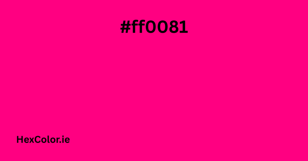
| Bright Bubblegum Pink | #ff0081 | (255, 0, 129) |
| Hot Candy Pink | #ff48a5 | (255, 72, 165) |
| Soft Neon Pink | #ff77bc | (255, 119, 188) |
| Light Cotton Candy Pink | #ffaed7 | (255, 174, 215) |
| Pale Bubblegum Frosting | #ffcae5 | (255, 202, 229) |
Each of these colors is unique, but they blend beautifully when used together.
Understanding Each Shade
Let’s look closely at what each shade means, how it feels, and where it can be used:
1. #ff0081 – Bright Bubblegum Pink
This is the boldest color in the palette. It’s vibrant, electric, and full of energy. It grabs attention and is perfect for modern designs. This shade is popular in digital design, makeup, and bold fashion pieces.
Best used for:
- Headlines or titles
- Eye-catching logos
- Stylish dresses or jackets
- Youth-focused social content
2. #ff48a5 – Hot Candy Pink
Softer than the first color but still vibrant, this pink is warm, sweet, and friendly. It gives off a candy-like vibe, making it ideal for beauty and fashion themes.
Best used for:
- Beauty product packaging
- Girly brand visuals
- Accessories like handbags or scarves
- Event themes like birthdays or baby showers
3. #ff77bc – Soft Neon Pink
This shade has a glow to it but feels more gentle. It fits perfectly as a background or a supporting tone in a gradient. It’s playful yet calming.
Best used for:
- Website backgrounds
- Wallpaper designs
- Feminine stationery and cards
- Branding for gentle beauty or wellness products
4. #ffaed7 – Light Cotton Candy Pink
This color feels soft and sweet. It brings a calm and romantic mood. Often used for baby items, romantic designs, and delicate fashion looks.
Best used for:
- Baby girl clothing
- Romantic wedding themes
- Kawaii art and stickers
- Skincare packaging
5. #ffcae5 – Pale Bubblegum Frosting
The lightest color in the palette, it looks like pink frosting. It’s soft, smooth, and gentle on the eyes. Works well as a background or soft base color.
Best used for:
- Website or app backgrounds
- Product packaging
- Soft photo shoots or filters
- Minimalist pink layouts
Where to Use the Bubblegum Pink Palette
You can use this palette in many areas. It’s great for both online and offline projects. Here are some common uses:
Web Design
This palette fits well in websites that target younger, artistic, or feminine audiences. Use lighter shades for the background and bolder ones for headings or buttons.
Fashion
Bubblegum pink is a favorite in fashion. It can make a bold statement or offer a soft, romantic feel depending on the shade. From casual wear to event outfits, pinks are always trending.
Graphic Design
Designers love using this palette for posters, social media, marketing banners, and flyers. It’s perfect for events like Valentine’s Day or for fun product campaigns.
Packaging
Beauty and skincare brands often use this color palette because it feels clean, sweet, and appealing. Whether for perfumes, lip gloss, or body lotion, these shades create a luxurious look.
Home Decor
Adding pinks to a bedroom, nursery, or office can give the space a calm and fun feeling. Use bold shades as accents, like throw pillows or artwork, and softer ones for walls or curtains.
Why People Love the Bubblegum Pink Palette
Here are some reasons this palette is so popular:
- Feel-good colors – These shades create a happy, relaxed feeling.
- Nostalgia – Many people connect bubblegum pink with childhood and sweet memories.
- Versatility – From bold to pastel, these colors work well together and separately.
- Trendy – Pinks are part of modern styles like soft girl, Y2K, and kawaii.
Tips for Using This Palette
If you’re planning to use this color palette, here are some tips:
- Mix tones wisely – Blend light and dark shades for balance.
- Use neutral support – Combine with white, grey, or beige to keep things soft and readable.
- Try gradients – These pinks flow beautifully into each other, perfect for banners or buttons.
- Understand your audience – These shades work well for young, creative, and mostly female-focused audiences.
- Avoid overuse – Too much pink can be overwhelming, so balance it out for a more polished look.
Related Color Palettes
If you love the bubblegum pink palette, you might also enjoy these related ones:
- Bubblegum Blue – A mix of pinks and sky blues for a balanced vibe.
- Bubblegum Party – Includes purples, glitters, and playful colors.
- Bubblegum Dream – Very light pastels that feel dreamy and magical.
- Bubblegum Lake – Adds cooler blues and mints to the mix.
- Bubblegum Seafoam – Pinks mixed with fresh green for a unique twist.
- Bubblegum Sky – Combines pink with soft sky blue for a sunset-like feel.
Final Thoughts
The Bubblegum Pink Color Palette is more than just pretty shades. It’s a creative tool for expressing joy, sweetness, and style. Whether you’re designing a logo, creating a product, decorating a space, or sharing on social media, these colors can add a soft, fun, and positive mood to your work.
These five shades offer a wide range of feelings—from bold and energetic to light and peaceful. They remind us of carefree times and bring a sense of beauty to any design. If you want to create something that stands out and makes people smile, the bubblegum pink palette is the perfect choice.


