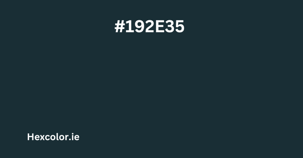
The color code #192e35 represents a deep, muted blue that carries a calm and mysterious vibe. It’s a sophisticated shade, perfect for creating an elegant, serious, or modern look in design. This color is ideal for backgrounds, accents, and even text when paired with contrasting shades. Let’s explore the details of this captivating color and how you can effectively use it in your projects.
Understanding #192e35
RGB and CMYK Composition
In the RGB color model, #192e35 is made up of:
- 9.8% Red (R: 25)
- 18% Green (G: 46)
- 20.8% Blue (B: 53)
This combination gives it a dark, cool-toned appearance. The blue is the strongest component, lending the color its deep, oceanic feel.
In the CMYK color model, typically used in printing, the breakdown is:
- 52.8% Cyan
- 13.2% Magenta
- 0% Yellow
- 79.2% Black
The high percentage of cyan and black contributes to its deep, muted blue shade.
Hue, Saturation, and Lightness
In the HSL (Hue, Saturation, Lightness) model, the color properties are:
- Hue: 195° (Positioned between blue and teal on the color wheel)
- Saturation: 35.9% (A desaturated tone, making it less vibrant and more subdued)
- Lightness: 15.3% (Very dark, giving it a dramatic and intense presence)
Meanwhile, in the HSV (Hue, Saturation, Value) model, it shows:
- Hue: 195°
- Saturation: 52.8%
- Value (Brightness): 20.8%
These values confirm that #192e35 is a deep, muted blue with a hint of green. Its dark and sophisticated look makes it a versatile choice for various design applications.
Best Uses of #192e35 in Design
This color’s deep, desaturated nature makes it perfect for:
- Backgrounds: It creates a bold yet elegant canvas that makes lighter elements pop.
- Text Overlays: Light-colored text, such as white or light gray, stands out beautifully against it.
- Accents and Borders: Use it sparingly to add a touch of sophistication to minimalist designs.
- Buttons and Call-to-Actions: It conveys reliability and stability, ideal for professional settings.
The color works exceptionally well for modern websites, tech products, fashion branding, or any design that requires a serious and refined look.
Color Combinations and Schemes
Complementary Color
The complementary color for #192e35 is #352019, a deep muted brown. Pairing these two creates a balanced contrast, ideal for classic and elegant designs.
Analogous Colors
Analogous schemes create harmony by using colors next to each other on the color wheel:
- #192035: A darker shade of blue, creating a monochromatic look.
- #19352e: A deep teal that maintains the cool, sophisticated vibe.
These combinations work well for cohesive and calming designs.
Split Complementary Colors
For a more dynamic look, try split complementary colors:
- #351920: A muted plum or maroon shade.
- #2e3519: A deep olive green.
These colors provide contrast while maintaining a subtle, understated palette.
Triadic Colors
Triadic schemes offer a balanced, vibrant look:
- #193520: A dark forest green.
- #35192e: A muted plum shade.
These create a visually appealing contrast while keeping the color harmony intact.
Tetradic Colors
Tetradic color schemes are more complex but striking:
- #193520 (Dark Green)
- #352019 (Deep Brown)
- #35192e (Muted Plum)
This scheme is perfect for intricate designs that need a more colorful, balanced look without overwhelming the viewer.
Shades, Tints, and Tones
Shades
Shades are created by adding black to the base color, making it even darker. For #192e35, shades like #060b0d and #0c171a work well for shadows or moody backgrounds.
Tints
Tints are made by mixing the base color with white, resulting in lighter versions like #2c515d and #3f7385. These are ideal for highlights or softer accents.
Tones
Tones are achieved by adding gray, which makes the color more subdued. Tones like #252829 and #222a2c are great for understated, elegant designs.
Accessibility and Color Blindness
To ensure your designs are accessible:
- Pair #192e35 with high-contrast colors like white or light gray for text.
- For people with Protanopia or Deuteranopia (red and green blindness), it appears as a grayish-blue.
- For Tritanopia (blue-yellow blindness), it looks like a muted greenish-gray.
- In Monochromacy (complete color blindness), it appears as a dark gray.
These contrasts make sure all users can easily read and interact with your designs.
Similar Colors and Alternatives
If you want alternatives close to #192e35 but with slight variations, try:
- #193535: A more teal version.
- #192c35: Slightly darker and more muted.
- #193033: A touch more green and less blue.
These subtle changes can help fine-tune your color palette while maintaining the same sophisticated vibe.
Practical Applications in Design
- Web Design: Perfect for headers, footers, and background sections with white or light text.
- App UI: Great as an accent color for buttons, navigation bars, and cards.
- Print Design: Use in business cards or brochures for a professional, reliable feel.
- Home Decor: Beautiful for walls, upholstery, or accent pieces to create a cozy, calming space.
CSS Code Snippets
To use #192e35 in your web designs, here’s some CSS you can easily implement:
/* Text Color */
.text-dark-blue {
  color: #192e35;
}

/* Background Color */
.bg-dark-blue {
  background-color: #192e35;
}

/* Border Color */
.border-dark-blue {
  border: 1px solid #192e35;
}
These simple classes can be applied to your HTML elements, ensuring consistent and elegant styling across your website or app.
Final Thoughts
#192e35 is a powerful, versatile color that adds depth, elegance, and mystery to any design. Its muted, dark blue tone is calming yet sophisticated, making it suitable for various applications, from digital designs to interior decor.
Whether you’re looking to create a modern, professional look or a cozy, intimate atmosphere, #192e35 is an excellent choice. Its subtle complexity allows it to function beautifully as both a primary color or as an accent to brighter, more vibrant shades.
For an impactful design, combine #192e35 with contrasting light shades while keeping accessibility in mind. This deep, desaturated blue is perfect for evoking feelings of calm, trust, and sophistication. Use it thoughtfully to elevate your creative projects.


