
Contrast Checker
Test, enhance, and preview your color combinations for better accessibility and design.
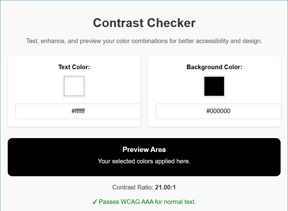
Preview Area
Your selected colors applied here.
Suggestions
How to Use the Advanced Contrast Checker Tool
The Advanced Contrast Checker Tool is designed to help you test, enhance, and improve the accessibility of your color combinations. Follow these steps to use it:
Select Your Colors
Text Color:
Use the color picker to select your desired text color.
Alternatively, you can type a HEX color code (e.g., #FFFFFF) directly into the text input field.
Background Color
Use the color picker to select your desired background color.
You can also type a HEX color code (e.g., #000000) into the background input field.
Preview Your Colors
The Preview Area will automatically update with your selected colors, allowing you to see how they look together.
Adjust the colors as needed to ensure they meet accessibility standards.
Check Accessibility
The tool calculates the contrast ratio between your selected text and background colors.
The result is displayed below the preview area:
✔ Passes WCAG Standards: Your colors meet accessibility guidelines.
✘ Fails WCAG Standards: Your colors do not meet the required contrast ratio for accessibility.
Use Suggestions (If Needed)
If your colors fail WCAG standards, the tool will provide suggested colors to improve contrast:
A lighter text color or a darker background color will be suggested.
Enter the suggested colors in the fields to ensure accessibility.
Enhance Contrast
Click the “Enhance Contrast” button to automatically adjust the text or background color for optimal readability.
Test Gradient Backgrounds
Use the “Gradient Background” button to test how your text looks against a gradient.
The preview will display a gradient combining your selected text and background colors.
Toggle Light/Dark Mode
Use the “Toggle Light/Dark Mode” button to switch between light and dark modes.
This helps you test how your colors perform in different environments.
Tips for Best Results
Contrast Ratios:
Aim for a ratio of 4.5:1 or higher for normal text.
For large or bold text, a ratio of 3:1 is acceptable.
For maximum accessibility, strive for a ratio of 7:1 or higher.
Font Size and Weight:
Consider the size and weight of your text when testing contrast. Larger or bolder text may require less contrast.