Color #F08375 is a soft, warm shade of red with a hint of orange. It’s often seen in design, fashion, and branding because of its inviting and friendly appearance. Let’s break it down into easy-to-understand details.
Basic Color Information
- Hex Code: #F08375
- RGB Values: (240, 131, 117)
- Red: 240
- Green: 131
- Blue: 117
- HSL Values:
- Hue: 7°
- Saturation: 80%
- Lightness: 70%
- CMYK Values: (0%, 45%, 51%, 6%)
- Web Safe Color Equivalent: #FF9966
What These Values Mean
- RGB (Red, Green, Blue) is used in digital displays. A higher red value means the color leans toward red.
- HSL (Hue, Saturation, Lightness) explains how the color is perceived.
- CMYK (Cyan, Magenta, Yellow, Black) is essential for printing. #F08375 has a strong magenta and yellow presence, making it a warm shade.
- XYZ and LAB Values help in scientific color matching and reproduction.
How Does #F08375 Look?
It is a peachy red color, appearing warm and soft. It is neither too bright nor too dull, making it great for various uses, from website backgrounds to clothing and interior design.
Shades and Tints of #F08375
Colors can be darkened (shades) or lightened (tints) by adding black or white.
Shades (Darker Versions)
- #D87569
- #C0685D
- #A85B51
- #904E46
- #78413A
Tints (Lighter Versions)
- #F18F82
- #F39B90
- #F4A89E
- #F6B4AC
- #F7C1BA
Complementary and Matching Colors
Every color has complementary colors that pair well with it. The complementary color of #F08375 is #75E2F0, a light sky blue. This creates a strong contrast, making both colors stand out.
Matching Color Schemes
- Triadic Colors: #75F083 (green) and #8375F0 (purple)
- Analogous Colors: #7A49A5 (purple) and #4974A5 (blue)
- Monochromatic Colors: Different variations of the same color family.
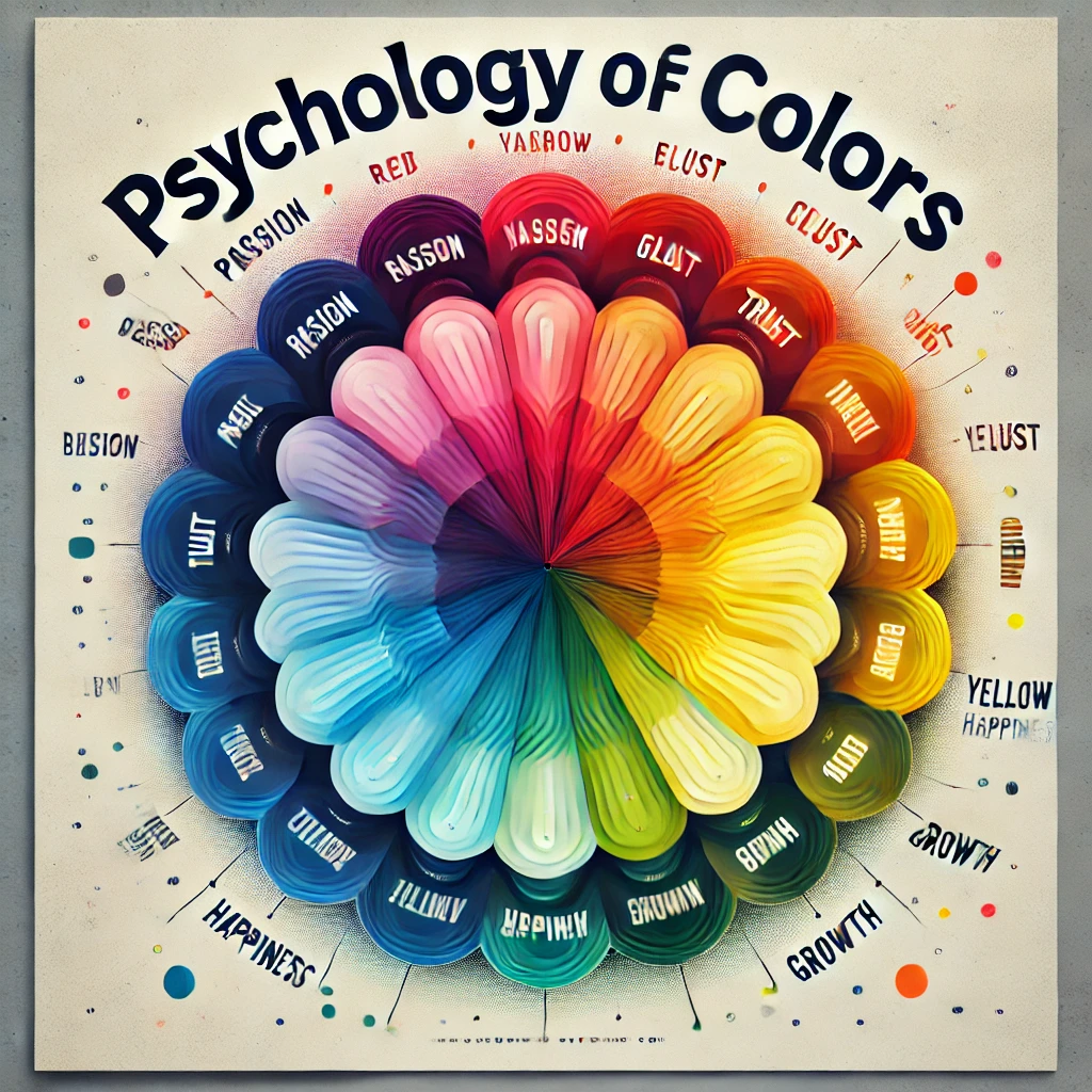
Psychological Impact of #F08375
Colors influence emotions and perceptions. #F08375 is a warm, friendly shade that evokes feelings of:
- Warmth and Comfort: Similar to sunset hues, making it inviting.
- Creativity and Passion: Warm colors often stimulate creativity.
- Soft Energy: Unlike bright reds, it’s less aggressive but still engaging.
- Optimism and Positivity: Bright yet soothing, it adds a cheerful touch.
Using #F08375 in Design
Because it’s a warm and soft shade, #F08375 is great for:
- Website Design: Backgrounds, buttons, or accents
- Fashion: Dresses, shirts, accessories
- Home Decor: Wall paint, pillows, upholstery
- Branding: Logos, packaging, advertisements
- Art and Illustrations: Works well in soft, vibrant artwork
Best Combinations for Different Industries
- Luxury & Beauty: Combine with deep golds or soft pastels.
- Technology: Pair with blues and grays for a modern touch.
- Food & Beverage: Complements natural tones like browns and oranges.
- Health & Wellness: Works well with earth tones for a calming effect.
User Experience Considerations
When using #F08375 in design, user experience (UX) is crucial:
- Readability: Ensure text on this color is highly readable by pairing it with contrasting shades like dark blue or black.
- Emotional Impact: Use it in areas where warmth and energy are needed, such as call-to-action buttons or highlighted sections.
- Accessibility: Ensure sufficient color contrast for users with vision impairments. Tools like WCAG contrast checkers can help.
- Navigation & Interaction: When used for interactive elements, ensure hover and active states are distinguishable.
CSS Code Examples for Web Design
If you’re a web designer, you can use #F08375 in your CSS code like this:
Background Color
.mybgcolor {
  background-color: #F08375;
}
Text Color
.myforecolor {
  color: #F08375;
}
Border Color
.mybordercolor {
  border: 3px solid #F08375;
}
Text Shadow
.textShadowHex {
  text-shadow: 4px 4px 2px #F08375;
}
Box Shadow
.divShadow {
  -moz-box-shadow: 1px 1px 3px 2px #F08375;
  -webkit-box-shadow: 1px 1px 3px 2px #F08375;
  box-shadow: 1px 1px 3px 2px #F08375;
}
Accessibility Considerations
When using #F08375 in design, consider:
- Contrast Ratios: Ensure text is legible against different backgrounds.
- Color Blindness: Avoid relying on color alone to convey information.
- Readability: Pair it with high-contrast colors like deep blue or black for text.
Fun Facts About #F08375
- Nature Inspiration: The color resembles a coral reef or a sunset sky.
- Popularity in Vintage Design: It has a retro feel, often seen in old posters and decor.
- Psychological Connection: It’s often linked to warmth, friendliness, and happiness.
Conclusion
#F08375 is a beautiful, warm shade of red that can be used in various creative ways. Whether in fashion, design, or branding, this color adds a soft, inviting touch. It pairs well with blue, green, and purple, and it’s easy to use in digital design with simple CSS code. If you’re looking for a color that feels warm, friendly, and stylish, #F08375 is a great choice! With its balance between energy and softness, it’s a versatile color that works across different industries and design styles.


