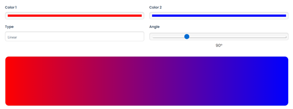
The hexadecimal color #ff0000 is a vibrant shade of red. This color code belongs to the RGB (Red, Green, Blue) color model, meaning it contains 255 red, 0 green, and 0 blue.
In the CMYK model, widely used in printing, this color consists of 0% cyan, 100% magenta, 100% yellow, and 0% black. This means that to print this color, only magenta and yellow need to be mixed.
Characteristics of Color #ff0000
- Hue: 0 degrees
- Saturation: 100%
- Lightness: 50%
- Decimal Code: 16711680
- Web Safe Color: Yes
Color Conversions
The #ff0000 color can be converted into different color formats:
- RGB: 255, 0, 0
- RGB Percentage: 100%, 0%, 0%
- CMYK: 0, 1, 1, 0
- HSL: 0°, 100%, 50%
- HSV (or HSB): 0°, 100%, 100%
- RYB: 100, 0, 0
- XYZ: 41.2, 21.3, 1.9
- CIELab: 53.23, 80.11, 67.22
- YUV: 76.245, 84.9723, 255.5
Color Distribution
The way this color is distributed varies depending on the color model used:
- RGB: Red 100%, Green 0%, Blue 0%
- RYB: Red 100%, Yellow 0%, Blue 0%
- CMYK: Cyan 0%, Magenta 100%, Yellow 100%, Black 0%
- CMY: Cyan 0%, Magenta 100%, Yellow 100%
Harmonious Color Combinations
Red can be harmonized in various ways to create balanced color palettes.
1. Complementary Colors
Opposite colors on the color wheel create contrast and balance.
- Red (#ff0000)
- Cyan (#00ffff)
2. Triadic Colors
Three colors that are equally spaced on the color wheel.
- Green (#00ff00)
- Red (#ff0000)
- Blue (#0000ff)
3. Tetradic Colors
Combining two pairs of complementary colors.
- Light Green (#80ff00)
- Red (#ff0000)
- Cyan (#00ffff)
- Purple (#8000ff)
4. Monochromatic Colors
Variations of the same hue.
- Light Red (#ffc7c7)
- Medium Red (#ffc5c5)
- Soft Red (#ffc2c2)
- Soft Red (#ffc0c0)
- Dark Red (#ffbdbd)
Shades and Tints
We can create red variations by adding white (tint) or black (shade).
Tints (Adding White)
- Pure Red (#ff0000)
- Light Red (#ff3333)
- Lighter Red (#ff6666)
- Rosy Red (#ff9999)
- Pastel Red (#ffcccc)
- White (#ffffff)
Shades (Adding Black)
- Pure Red (#ff0000)
- Dark Red (#cc0000)
- Wine Red (#990000)
- Intense Red (#650000)
- Bordeaux (#320000)
- Black (#000000)
How the Color Appears on Different Backgrounds
The #ff0000 color may look different depending on the background:
- White Background: The red appears vibrant and stands out.
- Black Background: The red remains strong but may appear brighter.
- Red Background: The contrast disappears, making text hard to read.
- White Text on Red Background: Stands out well.
- Black Text on Red Background: Offers reasonable contrast.
Contrast and Accessibility
The contrast between red and other colors affects readability.
White on Red (#ff0000)
- Large Text: Compliant with WCAG AA
- Any Text: Not compliant with WCAG AA
- Large Text: Not compliant with WCAG AAA
- Any Text: Not compliant with WCAG AAA
Black on Red (#ff0000)
- Large Text: Compliant with WCAG AA
- Any Text: Compliant with WCAG AA
- Large Text: Compliant with WCAG AAA
- Any Text: Not compliant with WCAG AAA
CSS Usage Examples
If you want to use this color on websites, here are some CSS examples:
Red Text
<span style="color:#ff0000;">Here is the text.</span>
Red Background
<p style="background-color:#ff0000;">The content goes here.</p>
Red Border
<div style="border:1px solid #ff0000;">Content goes here</div>
CSS Classes
.text {color:#ff0000;}
.background {background-color:#ff0000;}
.border {border:1px solid #ff0000;}
Random Colors
Here are some colors that can be combined with red:
- #c31738 (Dark Red)
- #ffd276 (Soft Yellow)
- #398b3a (Medium Green)
- #e9dc7d (Light Yellow)
- #a58d1c (Mustard)
- #310161 (Dark Purple)
- #257091 (Teal Blue)
- #b6d09c (Pastel Green)
- #13a988 (Aqua Green)
- #a126e3 (Vibrant Purple)
- #f5d381 (Pale Yellow)
- #5f7e6a (Grayish Green)
Conclusion
The #ff0000 red is a strong and striking color, ideal for attracting attention. It is widely used in graphic design, fashion, advertising, and technology. Its high contrast and vibrancy make it a popular choice for highlighting visual elements like buttons, alerts, and logos.
Combining it correctly with other colors can create stunning effects, whether for a modern and bold look or a classic and balanced style. When using it, consider contrast to ensure accessibility and readability.
If you’re working on a project, experiment with shades and color combinations to find the perfect balance!


