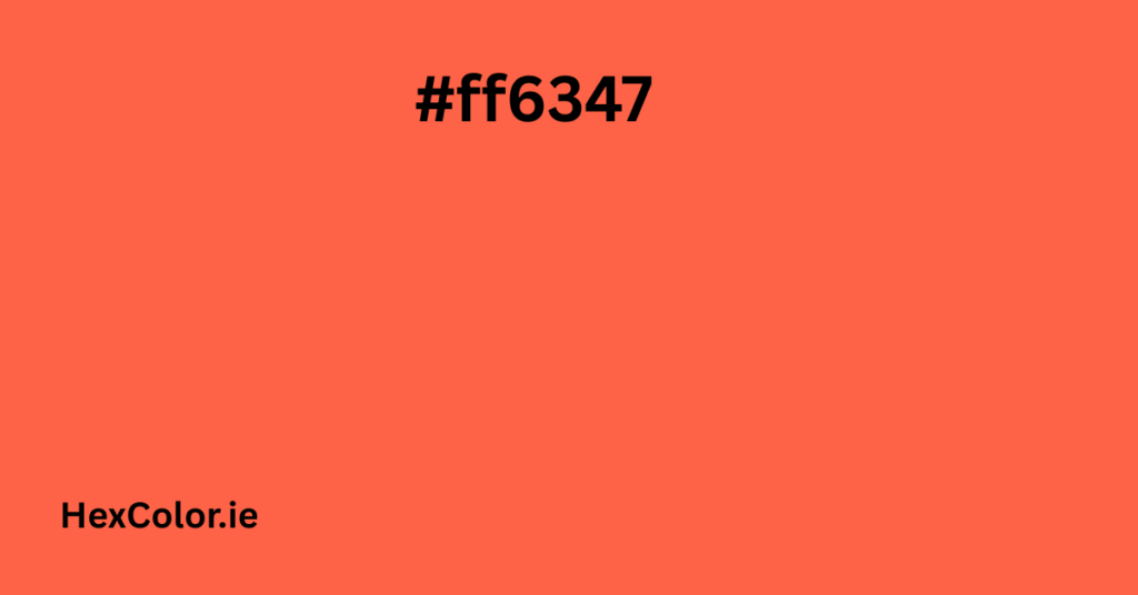
The color #ff6347, also called Tomato, is a bright and energetic color. It’s a mix of red and orange that feels warm, fresh, and full of life. If you’ve ever seen a ripe tomato, you’ll recognize this rich shade right away.
In this article, we’ll explore everything about the Tomato color—from how it looks, how it’s made, and how you can use it in designs, websites, or everyday inspiration. Don’t worry—we’ll keep it simple and easy to follow.
What Does #ff6347 Look Like?
The color #ff6347 is a warm, reddish-orange shade. It looks like a juicy tomato fresh off the vine. It’s not as dark as brick red, and not as light as peach—it’s right in the middle. It gives off a lively, energetic vibe, making it perfect for attention-grabbing designs.
If you’re thinking of using this color for something fun, bold, or full of emotion, it’s a great choice!
Color Meaning: What Tomato Color Represents
Tomato color often gives off feelings of:
- Energy
- Passion
- Warmth
- Excitement
- Freshness
It’s a color that makes people stop and look, just like a bright red fruit in the garden. Because of its mix of red and orange, Tomato combines the strength of red with the playfulness of orange.
Technical Breakdown (In Easy Terms)
Here’s what makes up the Tomato color:
- Hex Code:
#ff6347 - RGB (Red, Green, Blue):
- Red: 255 (100%)
- Green: 99 (about 39%)
- Blue: 71 (about 28%)
This means it’s mostly red, with some green and blue to make it softer and more orange-like.
- CMYK (Print Colors):
- Cyan: 0%
- Magenta: 61%
- Yellow: 72%
- Black: 0%
This shows how printers would recreate this color—mostly using magenta and yellow inks.
- HSL (Hue, Saturation, Lightness):
- Hue: 9.1° (red-orange range)
- Saturation: 100% (very vivid)
- Lightness: 63.9% (not too dark, not too light)
What Colors Go Well With Tomato?
Tomato pairs well with several other colors. Whether you want contrast, harmony, or something playful, here are some great combos:
1. Complementary Color:
- #47e3ff – A bright blue (great for high contrast).
2. Analogous Colors:
- #ffbf47 – A warm yellow-orange
- #ff4787 – A reddish-pink
These sit next to Tomato on the color wheel and give a warm, smooth look.
3. Split-Complementary Colors:
- #47ffbf – A mint green
- #4787ff – A sky blue
These add a bit of contrast while still looking balanced.
4. Triadic Colors:
- #47ff63 – A vibrant green
- #ff47e3 – A bright pink
These colors are spread evenly on the color wheel and create an energetic, colorful vibe.
Web Safe Version
Sometimes colors don’t appear the same on all screens. The closest web-safe color to Tomato is:
- #ff6633
This is very similar and works well on most web browsers.
Similar Colors to Tomato
Here are some colors that are close to Tomato if you want something a bit different:
- #ff5447 – A bit more red
- #ff7247 – Slightly more orange
- #ff9147 – Much lighter and warmer
These are great if you want something in the same family but not exactly the same.
Using Tomato in Design (Web, Graphics, or Decor)
Because of its bold and fresh feel, Tomato is often used for:
- Call-to-action buttons (like “Buy Now”)
- Logos that need to feel exciting
- Backgrounds to add energy
- Food-related branding (especially healthy or natural foods)
- Fashion and home decor for a pop of warm color
Here’s how you can use it in your CSS code:
cssCopyEdit.text {
  color: #ff6347;
}

.background {
  background-color: #ff6347;
}

.border {
  border: 1px solid #ff6347;
}
Shades, Tints, and Tones
Colors can be changed by adding black (shades), white (tints), or gray (tones).
Shades (Darker Versions):
- #ff310c – Very dark and dramatic
- #ff4220 – Still bold but less bright
- #ff5233 – Slightly deeper version of Tomato
Tints (Lighter Versions):
- #ff745b – A softer look
- #ff9582 – More pastel-like
- #ffd7d0 – Very light, almost peachy
Tones (Grayer Versions):
- #cd8579 – Muted, earthy version
- #b19995 – Soft and vintage-feeling
- #aa9e9c – Very muted and neutral
Color Blindness View
Color can look different to people with color blindness. Here’s how Tomato might appear to them:
- Protanopia: A bit more yellowish or brown
- Deuteranopia: Slightly pinkish
- Tritanopia: May look more dull and tan
- Monochromacy (Total color blindness): A shade of gray
- Achromatopsia: Muted or beige-like
So if you’re designing something for a wide audience, test your colors for accessibility.
Fun Fact: Where the Name “Tomato” Comes From
The name “Tomato” was chosen because it looks exactly like the bright red-orange color of ripe tomatoes. It’s been part of web-safe named colors in HTML and CSS for a long time, so you can even use it by writing:
cssCopyEditcolor: tomato;
Instead of the hex code!
Summary
The color #ff6347 (Tomato) is:
- Bright, warm, and energetic
- Great for catching attention
- Made of 100% red, 39% green, and 28% blue
- A strong choice for buttons, logos, websites, or décor
- Versatile when paired with blues, greens, or pinks
- Accessible if chosen carefully
Whether you’re designing a website, creating artwork, or just looking for a beautiful pop of color, Tomato is a color that brings energy and warmth to anything.


