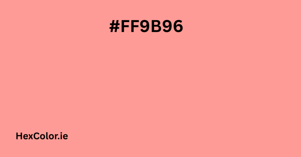
The hex color #FF9B96 is a beautiful and soft pink that brings warmth, gentleness, and charm to any design. Whether you’re working on a website, a graphic, or even choosing paint colors or fabrics, this color can add a lovely touch. In this guide, we’ll explore everything you need to know about this shade – from its technical details to where and how you can use it creatively.
What is #FF9B96?
The color #FF9B96 is a light pink shade with a soft reddish tone. It is bright, but not too strong. It feels cozy and friendly. This color is often used in design projects where a warm and romantic feeling is needed. It’s especially popular in beauty, fashion, and lifestyle industries.
RGB and HEX Breakdown
The HEX code for this color is #FF9B96. Let’s break that down:
- Red: 255
- Green: 155
- Blue: 150
In the RGB color model, these three values mix together to create the final color you see on your screen. Since red has the highest value here, the color leans heavily toward a pinkish-red.
In percentage terms:
- Red: 45.54%
- Green: 27.68%
- Blue: 26.79%
Color Models: HSL, HSV, CMYK
Here’s how #FF9B96 appears in different color systems:
HSL (Hue, Saturation, Lightness)
- Hue: 0.01°
- Saturation: 100%
- Lightness: 79%
This means the color is very saturated and quite light — that’s why it feels so airy and delicate.
HSV (Hue, Saturation, Value)
- Hue: 3°
- Saturation: 41%
- Value (Brightness): 100%
CMYK (Cyan, Magenta, Yellow, Black)
- Cyan: 0%
- Magenta: 39%
- Yellow: 41%
- Black: 0%
CMYK values are mainly used for printing. This color is light and doesn’t use black, which keeps it vibrant on paper.
Visual Feel of #FF9B96
This soft pink is gentle, warm, and comforting. It’s often linked with:
- Love
- Kindness
- Femininity
- Innocence
- Warmth
It’s not too bold or loud, which makes it ideal for backgrounds, accents, or soft details in design.
Shades and Tints of #FF9B96
Shades – Darker Versions:
If you darken #FF9B96 by adding black, you get deeper, more muted pinks. For example:
- #e58b87
- #cc7c78
- #b26c69
- #995d5a
These give a more vintage or earthy feel.
Tints – Lighter Versions:
If you lighten it by adding white, you get dreamy pastel tones:
- #ffa5a0
- #ffafab
- #ffb9b5
- #ffc3c0
These are great for baby showers, romantic themes, or spring designs.
Color Combinations with #FF9B96
1. Triadic Colors
Triadic colors form a triangle on the color wheel and are usually vibrant and balanced.
- #FF9B96
- #96FF9B (mint green)
- #9B96FF (lavender blue)
This combo is playful and colorful — great for modern art or creative branding.
2. Analogous Colors
Analogous colors sit next to each other on the color wheel.
- #FF9B96
- #FFD096 (peachy yellow)
- #FF96C6 (light pink-magenta)
These go well together for soft, feminine palettes.
3. Complementary Colors
Complementary colors are directly opposite on the color wheel.
- Complement of #FF9B96 is #96FAFF (light aqua)
Use this for contrast — pink and light teal make a fun, cheerful combo.
CSS Code Examples
If you want to use #FF9B96 on your website or blog, here are some easy ways:
Background Color
htmlCopyEdit<div style="background-color:#FF9B96">This is a background</div>
Text Color
htmlCopyEdit<p style="color:#FF9B96">This is pink-colored text</p>
Border Color
htmlCopyEdit<div style="border:3px solid #FF9B96">Bordered box</div>
Box Shadow
cssCopyEdit.divShadow {
  box-shadow: 1px 1px 3px 2px #FF9B96;
}
Text Shadow
cssCopyEdit.textShadow {
  text-shadow: 4px 4px 2px #FF9B96;
}
These styles give your design a soft and elegant look.
Where to Use #FF9B96
Here are some real-life ideas for using this color:
- Web Design: Backgrounds, buttons, banners
- Fashion: Dresses, accessories, makeup packaging
- Home Decor: Wall paint, curtains, throw pillows
- Branding: Logos for beauty, skincare, lifestyle products
- Print Design: Invitations, flyers, posters
- App UI: Soft notification backgrounds, highlights, icons
Accessibility Tip
Even though #FF9B96 is beautiful, it’s important to test for contrast. It works well on white and black backgrounds but may be hard to read on light colors. Always check color accessibility to make sure everyone can read your text or view your design comfortably.
Related Colors to Explore
If you like #FF9B96, here are a few other similar tones:
- #F29988 – Slightly more peach
- #F09DA3 – A little more muted pink
- #FF96C6 – Pink with a magenta hint
These colors go well with each other and can help you build a cohesive palette.
Final Thoughts
The color #FF9B96 is more than just a hex code — it’s a feeling. It brings warmth, softness, and beauty to any project. From websites to fashion to interior design, it’s a lovely pink that’s easy on the eyes and full of emotion. Whether you’re designing a blog, painting a room, or creating digital art, this shade is a great choice when you want something light, loving, and full of personality.


