Orange is a color that radiates warmth, energy, and enthusiasm. Among its many shades, #FFA500 stands out as a classic, vibrant hue often referred to simply as “Orange1” in web design. This bright, eye-catching color has a rich presence in digital and physical spaces, from branding to art. Let’s dive into what makes #FFA500 special, its technical details, and its real-world applications—all explained in simple, engaging terms.
Breaking Down #FFA500: The Basics
At its core, #FFA500 is a hex code representing a specific shade of orange. Hex codes are six-digit combinations used in web design to define colors. Here’s what each part means:
- FF = Maximum red (255 in decimal)
- A5 = Moderate green (165 in decimal)
- 00 = No blue
This mix creates a bold, warm orange that’s neither too red (like a tomato) nor too yellow (like a lemon). It’s the perfect balance—a true orange.
Other Color Systems
- RGB: (255, 165, 0) – Pure red, a bit of green, no blue.
- HSL: Hue 39°, Saturation 100%, Lightness 50% – A fully saturated, mid-brightness orange.
- CMYK: 0% Cyan, 35% Magenta, 100% Yellow, 0% Black – Ideal for print (since it avoids heavy black ink).
Shades & Tints: Lightening or Darkening #FFA500
Want a softer or deeper version of this orange? Designers often tweak shades and tints:
Darker Shades (More Black Added)
- #E59400 – A slightly muted orange.
- #996300 – A deep, burnt orange.
- #4C3100 – Almost brown, great for earthy designs.
Lighter Tints (More White Added)
- #FFAE19 – A softer, golden-orange.
- #FFC966 – A pastel-like, creamy orange.
- #FFEDCC – A very light peach, almost off-white.
These variations help in creating gradients, shadows, or complementary palettes.
How #FFA500 is Used in Design & Branding
Orange is a high-energy color—it’s friendly, inviting, and attention-grabbing. That’s why many brands use it:
- Nickelodeon – Bright orange logo = fun, youthful energy.
- Fanta – The soda’s vibrant orange packaging screams sweetness and excitement.
- Home Depot – Combines orange (action) with white (trust) for a DIY-friendly feel.
In web design, #FFA500 is often used for:
✅ Call-to-action buttons (Buy Now, Sign Up)
✅ Highlighting important text
✅ Creating a warm, welcoming vibe
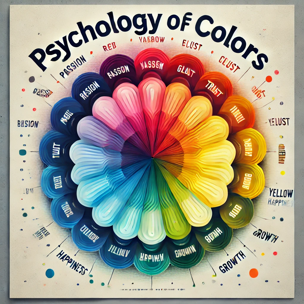
Color Psychology: What Does #FFA500 Communicate?
Colors influence emotions. Here’s what orange (especially #FFA500) makes people feel:
- Creativity & Adventure – Artists and travel brands love it.
- Friendliness & Approachability – Think of social media “like” buttons.
- Urgency (But Not Danger) – Unlike red, orange feels exciting, not alarming.
However, too much orange can feel overwhelming, so balance it with neutrals like white, gray, or navy blue.
How to Use #FFA500 in Your Projects
For Digital Design (Web & Apps)
- CSS Code:css.orange-button { background-color: #FFA500; color: white; padding: 10px 20px; border-radius: 5px; }
- Text Shadow Effect:css.text-orange-glow { text-shadow: 2px 2px 4px rgba(255, 165, 0, 0.5); }
For Print (Posters, Logos, Packaging)
- Use CMYK: 0, 35, 100, 0 for accurate printing.
- Pair with dark blue (#005AFF) for high contrast.
Home Décor & Fashion
- Throw pillows, accent walls, or statement clothing in #FFA500 add a pop of energy.
- Works well with teal, charcoal, or gold.
Fun Facts About #FFA500
🔸 Web-Safe Color: In early internet days, #FFA500 was one of the 216 “web-safe” colors that displayed consistently across monitors.
🔸 Hunter-Lab & CIE-Lab: These complex color models help scientists and printers match #FFA500 perfectly in different lighting.
🔸 Complementary Color: The opposite of #FFA500 on the color wheel is #005AFF (a cool blue), making them a striking pair.
Final Thoughts: Why #FFA500 Stands Out
Whether you’re designing a website, branding a product, or just love bold colors, #FFA500 is a timeless choice. It’s cheerful, dynamic, and impossible to ignore—just like a sunset or a ripe tangerine.
Next time you see this orange in a logo, ad, or even nature, you’ll appreciate the mix of science, art, and psychology behind it.


