What is #f08375?
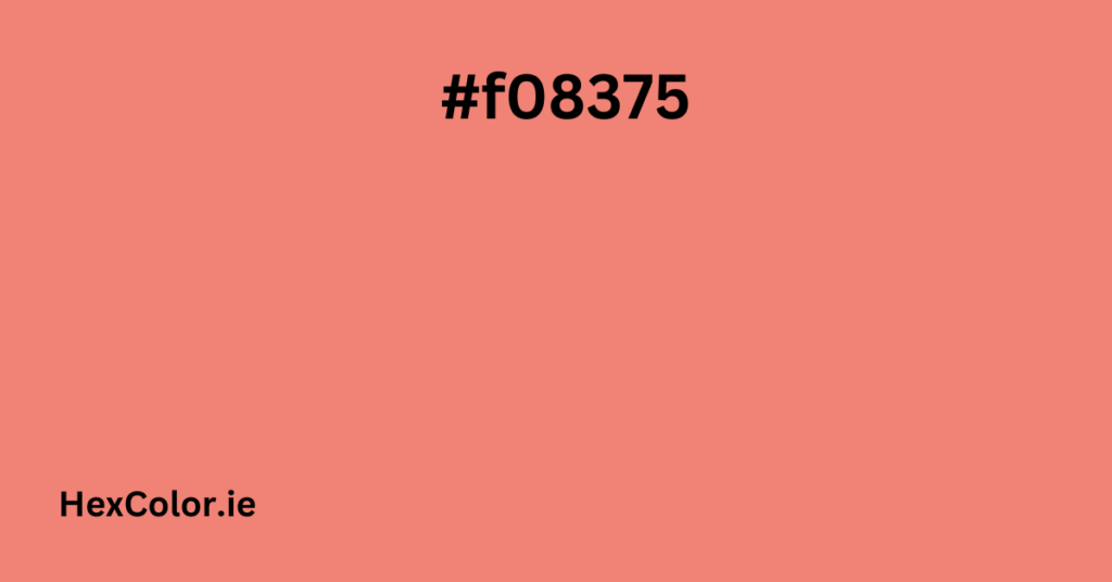
#f08375 is a warm, coral-red color that sits somewhere between red and orange. It’s a soft, inviting color that feels both vibrant and soothing at the same time. In technical terms, it’s a hexadecimal color code used in digital design. Here’s what the code means:
- Red: 240 (out of 255)
- Green: 131 (out of 255)
- Blue: 117 (out of 255)
This combination creates a bright, warm tone that’s perfect for adding a pop of color to designs.
Where Can You Use #f08375?
This color is versatile and can be used in many creative ways. Here are some ideas:
- Web Design:
- Use it for call-to-action buttons, links, or highlights to grab users’ attention.
- Pair it with neutral backgrounds (like white or light gray) to make it stand out.
- Branding:
- If your brand represents warmth, creativity, or energy, this color is a great choice for logos, packaging, or marketing materials.
- Interior Design:
- Use it as an accent color for walls, furniture, or decor items like cushions, rugs, or artwork.
- Fashion:
- This color works well in spring and summer collections. Think dresses, scarves, or accessories.
Shades and Tints of #f08375
If you want to adjust the color slightly, you can use its shades (darker versions) or tints (lighter versions). Here are some examples:
Shades (Darker Versions):
- #D87569: A deeper, muted version.
- #C0685D: A richer, earthy tone.
- #A85B51: A more subdued shade.
- #78413A: A dark, burgundy-like color.
Tints (Lighter Versions):
- #F18F82: A softer, lighter coral.
- #F39B90: A pale, peachy tone.
- #F4A89E: A very light, pastel version.
- #FDF2F1: An almost white tint with a hint of pink.
Color Combinations
To create a visually appealing design, you can pair #f08375 with other colors. Here are some suggestions:
- Analogous Colors: These are colors next to each other on the color wheel. For #f08375, these include:
- #F07A49: A warm orange.
- #A54974: A muted pinkish-purple.
- Complementary Color: This is the color directly opposite on the color wheel. For #f08375, it’s:
- #75E2F0: A soft cyan-blue, which creates a striking contrast.
- Monochromatic Colors: These are variations of the same color with different lightness or saturation. For example:
- #F77F7E: A slightly brighter red.
- #FD8570: A more orange-toned version.
Emotional Impact of #f08375
Colors can influence emotions and perceptions. Here’s what #f08375 represents:
- Warmth: It feels cozy and inviting.
- Energy: The red undertone adds a sense of vitality and passion.
- Creativity: The coral-like hue can inspire imagination and innovation.
CSS Code for #f08375
If you’re using this color in web design, here are some CSS snippets to help you get started:
/* Text Color */
.text-color {
  color: #f08375;
}

/* Background Color */
.bg-color {
  background-color: #f08375;
}

/* Border Color */
.border-color {
  border: 3px solid #f08375;
}

/* Text Shadow */
.text-shadow {
  text-shadow: 4px 4px 2px rgba(240, 131, 117, 0.8);
}

/* Box Shadow */
.box-shadow {
  box-shadow: 1px 1px 3px 2px #f08375;
}
Tips for Using #f08375 Effectively
- Readability: If you’re using this color for text, make sure the background color provides enough contrast. For example, use white or light gray as the background.
- Accessibility: Ensure your design is accessible to all users, including those with visual impairments. Tools like contrast checkers can help.
- Consistency: If you’re using this color for branding, stay consistent with the shade across all platforms.
Why is #f08375 a Great Choice?
- It’s eye-catching but not overwhelming.
- It works well in both digital and print designs.
- It’s versatile and can be used in various industries, from fashion to tech.
Final Thoughts
#f08375 is a beautiful, warm color that can add life and energy to your designs. Whether you’re using it for web design, branding, or decor, it’s a great choice for creating a welcoming and creative vibe. By following the tips and ideas in this guide, you can use this color effectively and create a great user experience. If you have any questions, feel free to ask


