If you’re someone who loves rich, magical, and mysterious shades, the Purple Space color palette is perfect for you. This palette is filled with beautiful tones of purple that feel like you’re floating in a dreamy galaxy. Whether you’re working on a digital design, planning a room makeover, creating an outfit, or simply looking for color inspiration, this palette brings an artistic and calm vibe to any project.
Let’s dive into the colors, what makes them special, and how you can use them in everyday life.
What Is the Purple Space Color Palette?
The Purple Space color palette was created by flowerbees and has been favorited by many users for its stunning mix of purples. It includes five main colors, each moving from light and bright to deep and dark. This smooth transition creates a galaxy-like feeling—almost like a trip through outer space.
Here are the colors in the palette:
| Color | Hex Code | RGB |
|---|---|---|
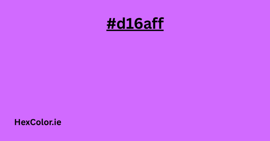
| Light Lavender | #d16aff | (209, 106, 255) |
| Bright Purple | #bb44f0 | (187, 68, 240) |
| Deep Violet | #9614d0 | (150, 20, 208) |
| Dark Purple | #660094 | (102, 0, 148) |
| Space Black Purple | #310047 | (49, 0, 71) |
Color Breakdown (In Simple Words)
Let’s take a closer look at each color and how it adds to the overall feel of this spacey theme.
1. #d16aff – Light Lavender Glow
This shade is soft, dreamy, and has a gentle brightness. It feels light and almost magical—like the first star that appears in the evening sky. It’s great for highlighting or soft backgrounds. Designers often use this color to soften up a bold design or to give a light purple vibe without going too deep.
2. #bb44f0 – Bright Purple Burst
This one is bolder and more vivid. It grabs attention but still feels calm and creative. It’s the kind of purple that feels fun and futuristic. If you’re designing something like a logo, website banner, or modern art piece, this color stands out while still blending with the others in the palette.
3. #9614d0 – Deep Violet Magic
This deep purple gives a touch of mystery. It sits perfectly in the middle—dark enough to add depth but not too heavy. It works well for shadows, contrast, or even as a main background if you’re going for a night-sky look. This color has a powerful, royal feel to it.
4. #660094 – Cosmic Dark Purple
This tone starts to dip into the darker side of purple. It gives off strong space vibes, like the edge of a galaxy. It’s rich, intense, and full of depth. You can use it for bold text, deep shading, or anything that needs a little drama and richness.
5. #310047 – Black Purple Galaxy
This is the darkest shade in the palette—almost black, but with a hint of purple. It brings the whole palette together and gives it that space feel. It can be used for backgrounds, outlines, or to create contrast. Think of it as the night sky behind the stars.
Why People Love the Purple Space Palette
People are naturally drawn to purple. It’s often seen as a color of creativity, imagination, mystery, and spirituality. When you put five different purples together—from light and fun to dark and moody—you get something that feels full of depth and emotion.
The Purple Space palette is loved because it:
- Looks magical and futuristic
- Is easy to mix and match
- Works for both light and dark themes
- Feels calm but still exciting
How to Use This Palette in Real Life
Whether you’re a designer, artist, or just someone who loves playing with colors, there are many ways you can use this palette:
1. Digital Art and Design
The Purple Space palette is great for websites, mobile apps, games, and digital illustrations. You can use lighter shades for highlights and darker ones for backgrounds or shadows. It also works well in sci-fi, fantasy, or space-themed artwork.
2. Interior Design
Want to create a bold and beautiful room? Try using these shades for walls, cushions, or even LED lighting. The lighter shades can bring in a soft, relaxing feel, while the deeper purples create mood and depth.
3. Fashion and Style
Purple is a color that stands out but still feels elegant. You can mix these shades in clothing, nail polish, or makeup. Lighter purples look great for a soft, feminine look, while the darker ones feel bold and stylish.
4. Branding and Marketing
If you want your brand to feel unique and creative, this palette can be a great fit. Purple is often used by tech companies, beauty brands, or anything that wants to feel imaginative and premium.
5. Crafts and DIY Projects
Whether you’re making digital collages, painting, or scrapbooking, this palette gives you a lot of creative freedom. These colors blend beautifully together and create a galaxy vibe that’s perfect for themed crafts.
Similar Color Palettes You Might Like
If you’re into the Purple Space palette, you might also enjoy these:
- Purple-Grey – A mix of soft purples and greys, great for calm and elegant designs
- Purple Light – Soft and airy shades, perfect for pastel-themed designs
- Purple and Orange Sunset – Combines warm sunset oranges with purples for a dreamy dusk effect
- Purple Aesthetic – Trendy purples often used in social media graphics and mood boards
- Purple and Blue Mix – A spacey combo that blends purple and deep blues
- Purple Anime Hair – Fun, vibrant purples often used in anime-style art and character design
Final Thoughts
The Purple Space color palette is more than just a group of colors—it’s a feeling. It brings together light and dark, calm and bold, mystery and beauty. Whether you’re a designer or just someone looking for color inspiration, this palette can spark your creativity and give your project that out-of-this-world touch.
You don’t need to be an expert in design to enjoy this palette. Just pick the colors that speak to you and start exploring. Whether you’re creating digital art, painting a room, or building a brand, the Purple Space palette offers endless possibilities.
So go ahead—dive into the galaxy of purples and create something amazing.


