
Red is a strong, bold, and powerful color. It easily grabs attention and can make your design look energetic and emotional. If you’re working on a website, graphic, UI, or brand design, knowing how to use red correctly can make a big difference.
In this article, you’ll learn everything about red—from its color codes to how to use it for better visual impact. This guide follows Google’s latest helpful content guidelines, so it’s reliable and easy to understand.
What Is the Red Color?
Red is one of the three primary colors in the RGB color system. It sits between orange and purple on the color wheel. You cannot mix other colors to create red, but red helps create many other colors like pink, maroon, burgundy, and orange.
It’s a warm color and often used to express:
- Love
- Energy
- Passion
- Power
- Alertness
Every shade of red has a different emotional feel. For example:
- Bright red = Bold and exciting
- Rose red = Romantic and soft
- Dark red = Elegant and serious
Red Color Codes for Web and Design
If you’re designing for screens (like websites or apps), it’s important to use standard color codes so the red appears the same on all devices. Here’s a commonly used bright red and its codes:
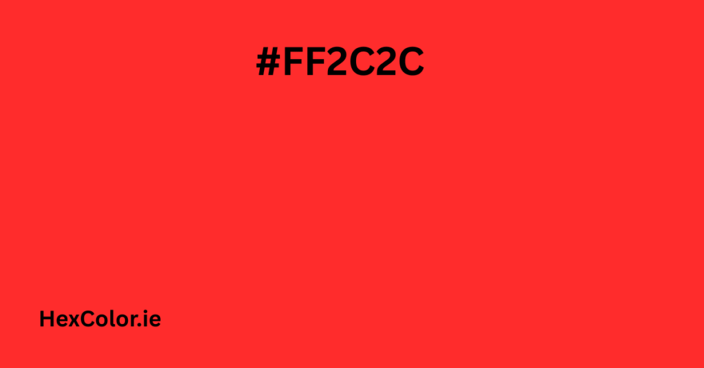
- Hex code:
#FF2C2C - RGB:
255, 44, 44(That’s 100% red, 17.3% green, and 17.3% blue) - HSB:
0°, 83%, 100% - HSL:
0°, 100%, 59%
These codes are essential for web developers, UI designers, and graphic creators to maintain color consistency.
How Red Looks on Digital Screens
Red appears vibrant and strong on digital screens. It’s one of the first colors people notice, which is why it’s often used for:
- Buttons
- Error messages
- Sale banners
- Call-to-action (CTA) items
However, red can be overwhelming if used too much. It’s better to use red as an accent color, not a background.
Tip: Use tools like Figma’s accessibility plugin to make sure your red color has enough contrast with text (very important for SEO and user experience).
SEO Tip: Use Red in a Way That Improves UX
Google now focuses more on User Experience (UX) and design clarity. Using red properly can help you:
- Highlight important buttons
- Show warnings clearly
- Increase conversions through CTA elements
- Create an emotional connection in branding
Just make sure your red doesn’t hurt readability or make the design stressful to look at. Keep balance with other soft or neutral colors.
Colors That Match Well with Red
Pairing red with the right colors can make your design look professional and clean. Here are color combinations that work well:
- White – clean and modern
- Black – bold and powerful
- Gray – neutral and balanced
- Gold or Yellow – rich and elegant
- Navy Blue – calm and serious
- Blush Pink – soft and romantic
Red Color Palette (Example):
bashCopyEdit#FF2C2C - Bright Red
#FFBFBF - Light Pink
#FF7081 - Coral
#F43378 - Deep Rose
You can use this palette in branding, fashion design, or website UI to create a balanced and attractive visual theme.
Colors That Clash with Red
Not every color looks good with red. Avoid combinations that can make your design look confusing or harsh:
- Neon colors – too loud and distracting
- Bright green – unless it’s for Christmas themes
- Some purples or oranges – depending on the tone, may not match well
Before finalizing your design, use tools like color contrast checkers to make sure everything looks good.
What Red Symbolizes (In Marketing and Culture)
Red is full of meaning. Depending on the context, red may represent:
- Love and passion – often used in dating, weddings, or Valentine’s Day
- Urgency or importance – used in sales, marketing banners, and warning alerts
- Power and luxury – popular in luxury brands and high-end logos
- Courage and action – perfect for motivational posters or social campaigns
- Luck and celebration – in cultures like China, red means joy and prosperity
Marketers and designers use red to connect with human emotion and create urgency.
History of Red Color
Red has been part of human life since ancient times. Early humans used red pigments in cave art, and it has always been a symbol of life, fire, and energy.
In ancient Rome and Greece, red was used in war and politics. In the Middle Ages, it was the color of royalty and church leaders. Today, it remains a symbol of boldness, rebellion, and excitement in everything from fashion to branding.
How to Use Red Based on Google’s Latest Guidelines
To follow Google’s latest updates, keep these best practices in mind:
✅ High-quality, helpful content: Only include useful tips, not filler.
✅ Natural keyword usage: Use variations like “red color,” “red palette,” “red in design,” etc. naturally in content.
✅ Optimize for readability: Use short paragraphs, bullet points, and clear headings.
✅ Link to helpful tools: Like color wheels, palette generators, or accessibility tools.
✅ Mobile-friendly format: Break down content for mobile users.
✅ Image ALT text: If you use red color samples or palettes, describe them properly in ALT tags.
Final Thoughts
Red is a bold and expressive color that can bring your design to life. Whether you’re designing a logo, website, poster, or brand, red can:
- Draw attention
- Create emotion
- Boost conversions
- Build a strong identity
Just remember to use it wisely. Combine it with the right colors, make sure it’s readable, and test it for accessibility.
With the tips and insights in this article, you’re now ready to use red like a pro—confidently, creatively, and in a way that works with Google’s latest rules.

