Thanksgiving is more than just a holiday — it’s a feeling. It brings family, friends, and good food together. But let’s not forget about the colors that bring the whole season to life. Warm browns, rich reds, golden yellows, and burnt oranges surround us in decorations, fashion, and nature. That’s where the Thanksgiving color palette shines.
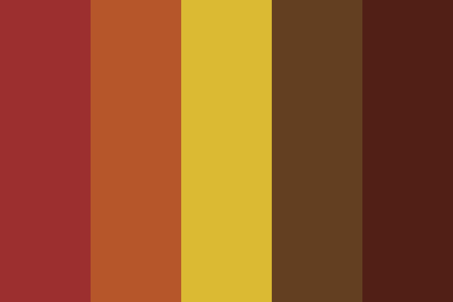
One beautiful Thanksgiving palette was created by skeisler and has a cozy mix of colors that perfectly capture the season. Let’s explore the colors in this palette, what they mean, and how you can use them to bring Thanksgiving vibes into your home, wardrobe, or creative projects.
Colors in the Thanksgiving Palette
Here are the colors in this Thanksgiving color palette and what makes each one special:
1. #9c2f2f – Deep Cranberry Red
This deep red is rich and warm, like cranberry sauce on the Thanksgiving table. It adds a bold and cozy feeling wherever it’s used. It can remind you of fallen leaves or the heart of a warm fire.
2. #b6562a – Burnt Orange
This burnt orange shade is classic for fall. It’s the color of pumpkins, falling leaves, and spicy pumpkin pie. It gives off a friendly, cheerful feeling and makes anything feel more festive.
3. #dbba33 – Harvest Gold
A golden yellow like this brings out the sunshine of the season. It reminds us of cornfields, golden leaves, and fresh baked cornbread. It’s bright, warm, and full of energy.
4. #633f21 – Rich Brown
This brown is earthy and deep, like tree bark or a warm cup of hot cocoa. It brings balance to the brighter colors and gives a grounded, natural feel.
5. #511f16 – Dark Chestnut
A darker brown-red tone, this color gives a cozy, rustic vibe. Think of roasted turkey, wooden furniture, or the color of dried autumn leaves. It’s rich and elegant.
What Do These Colors Mean?
Thanksgiving colors are inspired by nature and the harvest season. Each one has a special meaning:
- Red and orange represent warmth, comfort, and celebration.
- Yellow or gold symbolizes joy, sunshine, and abundance.
- Browns give a natural and rustic look, reminding us of the earth, home, and stability.
Together, these shades create a welcoming, heartwarming atmosphere perfect for a season of gratitude.
Where Can You Use These Colors?
These colors aren’t just for decoration—they can be used in many fun and creative ways during Thanksgiving. Here are a few ideas:
1. Home Decor
- Table settings: Use burnt orange napkins, cranberry-red plates, or golden-yellow candles.
- Centerpieces: Mix pumpkins, fall leaves, pinecones, and candles in these colors.
- Throw pillows and blankets: Add cozy touches to your living room in rich browns and deep reds.
2. Fashion
Dress in the spirit of Thanksgiving! Think warm sweaters, scarves, and boots in these seasonal shades. A burnt orange cardigan, cranberry-colored dress, or gold accessories can look stylish and festive.
3. Crafts and DIYs
If you love to craft, this palette is perfect for making Thanksgiving cards, wall art, or banners. Use these colors with paper, fabric, or paints to bring a handmade touch to the season.
4. Social Media Designs
Creating a Thanksgiving post or story? These shades are perfect for cozy fall-themed content. Add warm filters or use these colors for text and backgrounds.
Using the Palette in Design Projects
If you’re a designer or like working with digital tools, this color palette can add charm to your visuals. Whether you’re making invitations, website banners, or holiday promotions, use these hex codes to keep the theme consistent.
| Color Name | Hex Code | RGB Value |
|---|---|---|
| Deep Cranberry | #9c2f2f | (156, 47, 47) |
| Burnt Orange | #b6562a | (182, 86, 42) |
| Harvest Gold | #dbba33 | (219, 186, 51) |
| Rich Brown | #633f21 | (99, 63, 33) |
| Dark Chestnut | #511f16 | (81, 31, 22) |
Just plug these into your design software and get started!
Why These Colors Feel Like Thanksgiving
Thanksgiving is a holiday of warmth — warm hearts, warm homes, and warm meals. This palette uses deep and earthy tones to capture that warmth. These colors are calming, comforting, and joyful, just like Thanksgiving itself.
Think of:
- The flicker of candlelight on the dinner table.
- A pie baking in the oven.
- The golden glow of the afternoon sun through the leaves.
- Laughing around the table with people you love.
This palette brings all of that to mind and makes the season feel even more magical.
Matching the Colors with Food & Nature
What’s really cool is that these colors show up naturally in the things we see and eat during Thanksgiving:
- #9c2f2f – Cranberry sauce or red apples
- #b6562a – Pumpkin pie or sweet potatoes
- #dbba33 – Cornbread or squash
- #633f21 – Pecan pie or roasted chestnuts
- #511f16 – Turkey skin or wooden décor
Nature has its own Thanksgiving palette, and this one fits right in. From fallen leaves to baked goodies, these shades are everywhere!
Final Thoughts
The Thanksgiving color palette by skeisler is a perfect mix of warmth, earthiness, and holiday cheer. With its cozy reds, oranges, yellows, and browns, it reminds us of everything we love about fall. It’s not just pretty—it helps set the mood for gratitude, togetherness, and comfort.
Whether you’re decorating your home, designing something creative, or just picking out your Thanksgiving outfit, this palette can guide you. Use it to bring those cozy fall feelings to life and make your Thanksgiving extra special.


