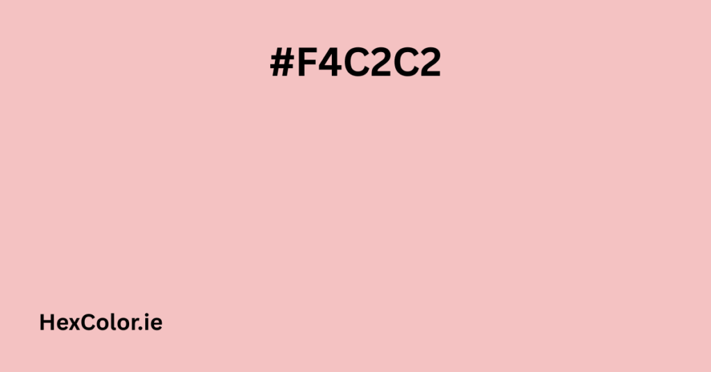
Few colors evoke tenderness as effortlessly as baby pink. With its soft, warm undertones and delicate presence, #F4C2C2 aptly named “Baby Pink”—is a hue that whispers rather than shouts. It’s the color of flushed cheeks, blooming petals, and the gentle glow of a sunset. Whether used in design, fashion, or decor, this shade brings a touch of sweetness and calm to any space.
Breaking Down Baby Pink
- Hex Code: #F4C2C2
- RGB Values: 244 (Red), 194 (Green), 194 (Blue)
- HSL: Hue 0°, Saturation 69%, Lightness 86%
- CMYK: 0% Cyan, 20% Magenta, 20% Yellow, 4% Black
This color sits in the pastel family, offering a muted yet warm pink that avoids being overly saccharine. Its near-neutral undertones make it versatile—pairing beautifully with creams, taupes, soft grays, and even deeper shades for contrast.
The Psychology of Baby Pink
Pink, in general, is associated with:
- Nurturing & Compassion – Often linked to caregiving and tenderness.
- Calmness – Lighter pinks have a soothing effect, reducing feelings of aggression.
- Youthfulness & Innocence – A nostalgic nod to childhood and softness.
Unlike bold fuchsias or neon pinks, #F4C2C2 doesn’t overwhelm. It’s a reassuring presence—think of a cozy nursery, a fluffy sweater, or the inside of a seashell.
Where You’ll See Baby Pink
1. Fashion & Beauty
- Clothing: A go-to for spring dresses, knitwear, and bridesmaid outfits.
- Makeup: Blush, lip gloss, and nail polish in this shade give a fresh, healthy glow.
- Accessories: Handbags, scarves, and shoes in baby pink add a feminine touch without being overly girly.
2. Interior Design
- Walls & Furniture: A perfect choice for creating serene bedrooms or inviting living spaces.
- Accents: Throw pillows, rugs, or ceramics in #F4C2C2 soften modern or minimalist decor.
- Weddings & Events: Often used in floral arrangements, table settings, and stationery for a romantic vibe.
3. Branding & Marketing
- Lifestyle & Wellness Brands – Conveys warmth and approachability.
- Beauty & Skincare – Suggests gentleness (ideal for sensitive skin products).
- Children’s Products – Evokes playfulness and sweetness.
How to Pair Baby Pink
Monochromatic Harmony
- Lighter: #FDF8F8 (almost white with a pink tint)
- Darker: #DBADAE (a dusky rose)
Complementary Contrasts
- Soft Mint (#C2F4E0) – A refreshing, balanced combo.
- Warm Beige (#F4E6C2) – Creates a cozy, neutral palette.
- Dusty Blue (#C2D4F4) – A dreamy, vintage-inspired match.
Bold Accents
- Deep Navy (#0A2463) – For a sophisticated contrast.
- Olive Green (#6B8E23) – Earthy yet elegant.
Fun Facts About Baby Pink
- In color theory, pink is technically a tint of red (red + white).
- Many cultures associate pink with kindness and nurturing.
- The popularity of millennial pink in the 2010s brought softer pinks back into trend.
Final Thoughts
#F4C2C2 is more than just a color—it’s a mood. Whether you’re designing a logo, painting a room, or picking out an outfit, this shade brings a sense of warmth and tranquility. It’s subtle enough to blend seamlessly yet distinct enough to make an impression. Next time you need a touch of softness in your life, let baby pink work its magic.


