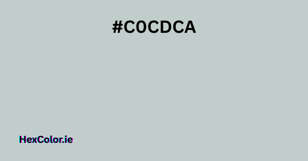
The hex color #C0CDCA is a subtle, muted shade that sits between gray and soft green. It’s a cool, understated tone often found in modern design, interiors, and digital graphics. Below, we’ll break down its characteristics, uses, and why it’s a popular choice for clean, minimalist aesthetics.
Breaking Down #C0CDCA
1. Color Values
- Hex: #C0CDCA
- RGB: (192, 205, 202)
- CMYK: (6%, 0%, 1%, 20%)
- HSL: (166°, 12%, 78%)
- HSV: (166°, 6%, 80%)
This color is a light gray with a slight green-blue undertone, making it feel fresh and airy without being overpowering.
2. What Does It Look Like?
Imagine a pale, misty morning—soft, cool, and slightly hazy. That’s the essence of #C0CDCA. It’s not stark white or deep gray but a gentle blend of both with a whisper of green.
- In Design: Works well as a background color for websites, apps, or print materials where a neutral yet sophisticated look is needed.
- In Fashion: Often seen in minimalist clothing, home decor, and tech products for a sleek, modern feel.
- In Branding: Used by companies that want to appear calm, professional, and slightly futuristic.
Shades and Tints of #C0CDCA
Darker Shades
- #ACB8B5 – A deeper, more muted version.
- #99A4A1 – A medium gray-green, good for accents.
- #606665 – A much darker, almost charcoal version.
Lighter Tints
- #C6D2CF – A slightly brighter, airier version.
- #D9E1DF – Almost white with a faint cool tone.
- #F2F5F4 – Nearly pure white with a hint of green.
These variations allow designers to create depth while keeping a cohesive, muted palette.
How to Use #C0CDCA in Design
1. Best Color Combinations
Since #C0CDCA is a soft neutral, it pairs beautifully with:
- Whites & Light Grays → For a clean, minimalist look.
- Deeper Blues & Greens → Adds contrast while keeping harmony.
- Warm Beiges & Taupes → Softens the coolness for a balanced feel.
Example Palette:
- Primary: #C0CDCA
- Secondary: #F5F5F5 (White Smoke)
- Accent: #5A7D7E (Deeper Teal)
2. Where It Works Best
- Web Design: As a background for text-heavy sites (easy on the eyes).
- Interiors: Walls, furniture, or decor in modern homes.
- Logos & Branding: For eco-friendly, tech, or wellness brands.
3. What to Avoid
- Pairing with Neon Colors → Clashes with its muted nature.
- Using in Small Text → Too light for readability.
Psychological Impact of #C0CDCA
This color evokes:
✅ Calmness – Like a quiet, misty morning.
✅ Sophistication – Feels modern and polished.
✅ Neutrality – Doesn’t overpower, making it versatile.
It’s not energizing or bold, so avoid using it where excitement is needed (e.g., call-to-action buttons)
CSS & Design Code Examples
1. Using #C0CDCA in Web Design
css
body {
  background-color: #C0CDCA;
  color: #333333; /* Dark gray for readability */
}

.button {
  background-color: #5A7D7E;
  color: white;
}
2. Text Shadow Effect
css
h1 {
  text-shadow: 2px 2px 4px rgba(192, 205, 202, 0.5);
}
Final Thoughts
#C0CDCA is a versatile, understated color perfect for designs that need a soft, professional touch. Whether in digital or physical spaces, it brings a sense of calm and modernity without being boring.
If you’re looking for a neutral that’s not too cold or too warm, this gentle gray-green is an excellent choice.


