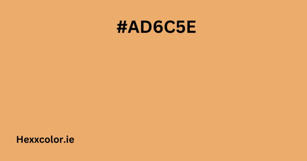
Understanding the Color #AD6C5E
The hex code #AD6C5E is a beautiful, warm shade that falls between faded orange and brown. It has a tranquil and inviting feel, making it an excellent choice for designs that aim for warmth and sophistication.
Color Breakdown
Understanding the different color models can help you use this shade more effectively in design and branding:
- Hex Code: #AD6C5E
- RGB Values: (173, 108, 94) – a blend of red, green, and blue
- HSL Values: (11°, 33%, 52%) – a slightly muted reddish-orange
- HSV Values: (11°, 46%, 68%) – medium brightness with moderate saturation
- CMYK Values: (0, 38, 46, 32) – used in print design, showing how much ink is required
Each model provides different insights into how the color appears in digital and print formats.
Similar Brand Colors
If you’re curious about brands using a similar shade, here are a few examples:
- Sony (#b24f3f) – 98.83% similarity
- Delectable (#cd595a) – 98.81% similarity
- Status Chart (#d7584f) – 98.73% similarity
- Craft CMS (#da5a47) – 98.67% similarity
- Periscope (#d75444) – 98.66% similarity
- Internet Society (#d25238) – 98.60% similarity
- WordPress.com (#d94f4f) – 98.56% similarity
- Gospel for Asia (#e15f5f) – 98.54% similarity
This shade is widely used in branding for its bold yet natural appeal.
Best Color Combinations
Triadic Colors
A triadic color scheme features three colors that are equally spaced around the color wheel, creating a dynamic and balanced look. For #AD6C5E, the best triadic colors are:
- #5EAD6C – a muted green
- #6C5EAD – a cool-toned purple
This combination creates a vibrant yet balanced aesthetic.
Analogous Colors
Analogous colors sit next to each other on the color wheel, offering a harmonious look:
- #AD795E – warm brownish-orange
- #AD865E – golden tan
- #AD945E – soft beige
- #AD5F5E – deep rust red
- #AD5E6A – muted rosy mauve
- #AD5E78 – earthy pink
These shades work well for cozy and natural designs.
Complementary Colors
Complementary colors lie on opposite sides of the color wheel, forming a bold and visually dynamic contrast that enhances vibrancy in design
- #5E9FAD – teal blue
- #357887 – deep sea blue
- #92C8D3 – light blue-green
- #D2F3FA – pale sky blue
- #FDFFFF – almost white
Using complementary colors adds energy and makes designs pop.
Monochromatic Colors
A monochromatic palette consists of different shades of the same color:
- #874335 – dark reddish-brown
- #602417 – rich earthy brown
- #3A0F05 – deep chocolate brown
- #D39E92 – soft peachy-brown
- #FAD9D2 – pale peach-pink
- #FFFEFD – near white
This scheme is perfect for elegant, warm, and minimalist aesthetics.
How to Use #AD6C5E in Design
This color works well in various design contexts, from websites to interior decor:
- Website Design: Great for backgrounds, buttons, and accent elements
- Branding: Works well in logos for natural, rustic, or vintage brands
- Interior Design: Perfect for warm, inviting spaces with wooden and earthy textures
- Fashion: A sophisticated color for clothing, accessories, and textiles
CSS Styling Guide
If you want to use #AD6C5E in web design, here’s how:
Background Color
<div style="background-color: #AD6C5E;">This has the background color</div>Font Color
<div style="color: #AD6C5E;">This has the font color</div>Gradient Examples
Triadic Gradient
.gradient1 {
    background: linear-gradient(to bottom, #5EAD6C, #9E92D3);
}
Analogous Gradient
.gradient2 {
    background: linear-gradient(to bottom, #AD795E, #AD5E78);
}
Complementary Gradient
.gradient3 {
    background: linear-gradient(to bottom, #5E9FAD, #FDFFFF);
}
Monochromatic Gradient
.gradient4 {
    background: linear-gradient(to bottom, #874335, #FFFEFD);
}
Final Thoughts
The color #AD6C5E is a versatile, warm, and inviting shade that can enhance a variety of design projects. Whether you use it for branding, interior decor, fashion, or web design, it provides a cozy, timeless, and sophisticated feel.
If you love earthy, natural tones, this color might be the perfect fit for your next project!


