What is #C27E79?
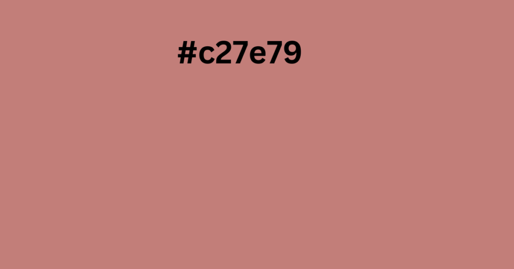
Color #C27E79 is a warm, earthy shade that belongs to the red family. It has a soft, muted feel, making it an excellent choice for various design projects, from interior decor to digital graphics. Let’s break it down in a simple and engaging way.
Color Composition of #C27E79
RGB (Red, Green, Blue) Values
- Red: 194
- Green: 126
- Blue: 121
CMYK (Cyan, Magenta, Yellow, Black) Values
- Cyan: 0%
- Magenta: 35%
- Yellow: 38%
- Black: 24%
HSL (Hue, Saturation, Lightness) Values
- Hue: 4.1°
- Saturation: 37.4%
- Lightness: 61.8%
This means that #C27E79 is a slightly desaturated red with a warm and inviting feel.
How is #C27E79 Created?
This shade is achieved by blending a very light peach (#FFFCF2) with a deep red (#850000). The result is a soft, muted red that is neither too bright nor too dark, making it perfect for balanced and elegant designs.
Closest Web-Safe Color
Web-safe colors ensure uniform display across different screens. The closest match to #C27E79 is #CC6666, which has a slightly stronger red tint.
Best Color Combinations with #C27E79
Choosing the right color combinations can enhance the beauty of #C27E79. Here are some of the best options:
Complementary Color
- #79BDC2 (Cool Teal) – A perfect balance of warm and cool tones.
Analogous Colors
- #C27999 (Soft Pink)
- #C2A379 (Muted Brown)
Split Complementary Colors
- #7999C2 (Dusty Blue)
- #79C2A3 (Muted Green)
Triadic Colors
- #7E79C2 (Soft Purple)
- #79C27E (Earthy Green)
Tetradic Colors
- #C279BD (Pastel Purple)
- #79C27E (Soft Green)
- #79BDC2 (Muted Blue)
Shades and Tints of #C27E79
Shades (Darker Variations)
Adding black creates richer, deeper shades:
- #A3504A (Rust Red)
- #522825 (Dark Brown)
Tints (Lighter Variations)
Adding white produces softer versions:
- #E7CCCA (Blush Pink)
- #F9F3F2 (Very Pale Peach)
How #C27E79 Appears to Color-Blind Individuals
Different types of color blindness can alter how this shade appears:
- Protanopia & Deuteranopia: It may look more muted, resembling dusty pink or brown.
- Tritanopia: It might shift toward a neutral beige.
- Achromatopsia (Complete Color Blindness): It appears as a shade of gray.
Where Can You Use #C27E79?
This color is incredibly versatile and works well in many areas:
1. Interior Design
- Perfect for warm, cozy spaces like bedrooms and living rooms.
- Works well with wooden furniture and soft textures.
2. Fashion & Beauty
- A great shade for autumn clothing, accessories, and makeup (like lipstick and nail polish).
3. Graphic & Web Design
- Used in branding, websites, and promotional materials for a sophisticated and elegant look.
4. Weddings & Events
- A romantic choice for wedding themes, invitations, and floral decorations.
5. Food & Packaging
- Common in chocolate, wine, and bakery product packaging, as it conveys warmth and richness.
How to Use #C27E79 in Web Design?
If you’re designing a website and want to incorporate this color, use the following CSS codes:
.text { color: #C27E79; }
.background { background-color: #C27E79; }
.border { border: 1px solid #C27E79; }
These styles help in applying #C27E79 to text, backgrounds, and borders in your web design.
Final Thoughts
#C27E79 is a beautiful, soft red that blends well with various colors. It’s warm, inviting, and perfect for creating elegant and welcoming designs. Whether you’re working on a website, decorating a space, or picking an outfit, this color offers endless possibilities!


